The Augmented Reality Project
- BLENDER - UNITY - VUFORIA - QUIXEL BRIDGE - ILLUSTRATOR -
Client Brief & Research
The client for this project was Safer At Work, the training and equipment division of Renewable Field Services Ltd. They offer a wide range of safety training packages/courses, all tailored for their customers to meet the requirements of the GWO (Global Wind Organisation) Certification. The client brief asked to develop virtual or augmented reality software that can be used to assist in the delivery of adult vocational training. The objective was to enhance the quality of the training by introducing realistic simulated environments for the learning to take place in. Speaking to the client after their presentation of the brief, it was said that the module they would like focused on would be First Aid Training. The timeframe for this project was 12 weeks spanning the whole of the 2nd semester.
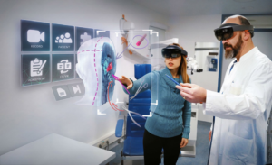
Looking into what software to use, I chose Blender as my 3D software due to wanting to master it, but I also chose Quixel Bridge as my platform for textures as I used it once before and wanted to become more familiar with it. I found that for making the AR project, the best to use would be Unity, as this was still a fairly new software to me which would provide plenty of learning, and also because it has multiple plug-ins installable for AR creations, which leads to my choice of the Vuforia Engine. This software is not only multi-platform (making it accessible by different users/devices), but offers object detection from given targets for recognition, allowing developers to upload images, models, object scans, and other target types to be detected. When exploring how technically feasible the client’s project was, I came to the conclusion that it was extremely feasible, finding several creations of similar content online. This includes a simulation made for a hospital environment training new surgeons how to perform certain surgery situations with the inside of the body being shown. The video of this I found confirmed that not only was the outline of what I imagined creating possible, but it could show great results and a user-friendly experience.
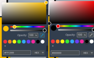
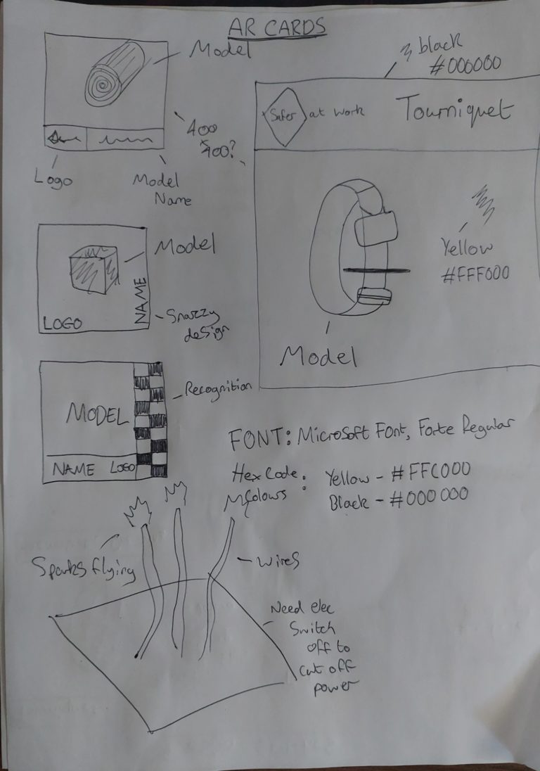
Going into this “group” project alone, several other roles needed to be filled and so I took it upon myself to research the design and branding of the software, making sure to give the client software that looks like its theirs. This involved getting familiar with the company website in order to make sure the logo, colours and typology were kept within the work too. The company logo had a predominant colour scheme of yellow and black, the yellow hex code being #FFC000 and the black being typical #000000. Choosing to adopt this within my later shown designs I kept note, and further emailed the client about the font used within the logo too which was a Microsoft font, Forte Regular.
Planning
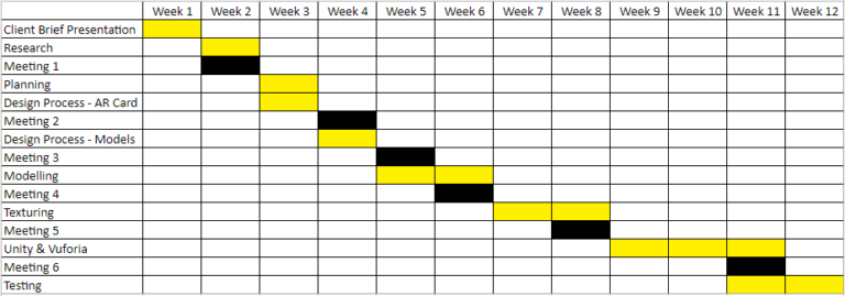
One of the first stages of planning for this project was time management. I created a GANTT chart detailing each step of the project over its 12 week span, including dates for meetings, and milestones for presentations. Some steps took place within the same weeks as my workload would be split into the different roles I was performing.
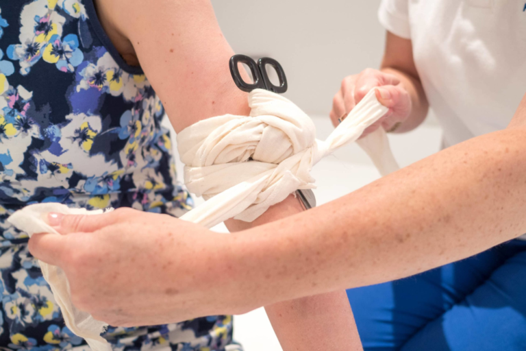
Coming up with ideas on how to go about the project was difficult at first, I researched briefly into the health and safety requirements looking for what to include in the project however found there were different courses with different features. Not knowing what to use within the project, the first client meeting was set-up and proved to be extremely beneficial. I received a presentation on the exact GWO module the client wanted to see worked on, and it detailed absolutely everything needed by me to get on with my planning. The main focus of the First Aid Module was looking at catastrophic bleeding and the correct way to handle it. This provided me with a strong outline of the equipment needing to be modelled, the interactivity the user would need to have with them and the approach on how to get the AR software to function. Furthermore, we agreed that the format of the AR software would be an Android APK as this would support devices that they are able to use within their business.
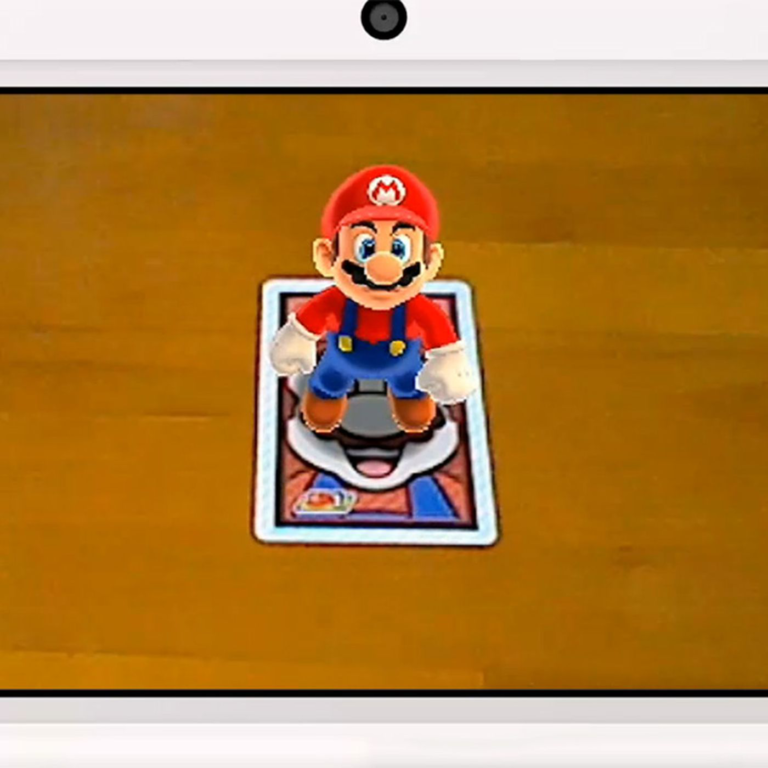
I delved into the AR aspect first, planning the functionality of what would do what and how. I proposed an idea to the client about AR cards that would showcase the different models to the course user, and allow them to interact with them seperately. Due to using Vuforia, I knew that image targets could be created so that when recognised by the software they would display the corresponding models. The client responded very positively to this approach after meeting in person and explaining it within their workspace in a more visual manner.
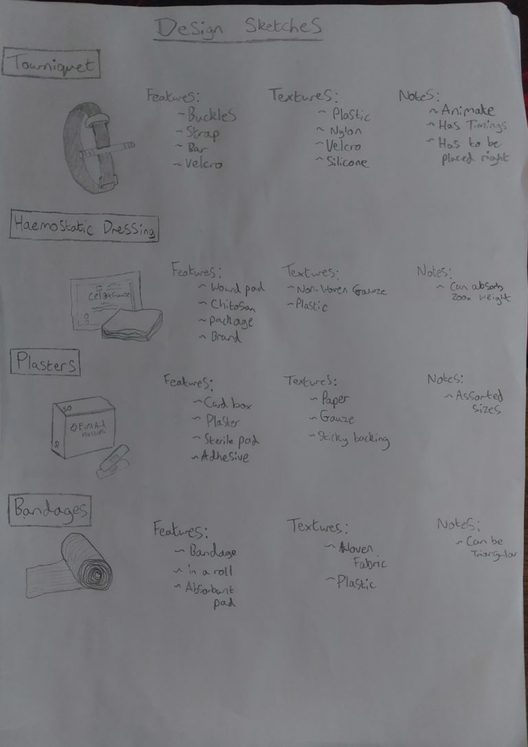
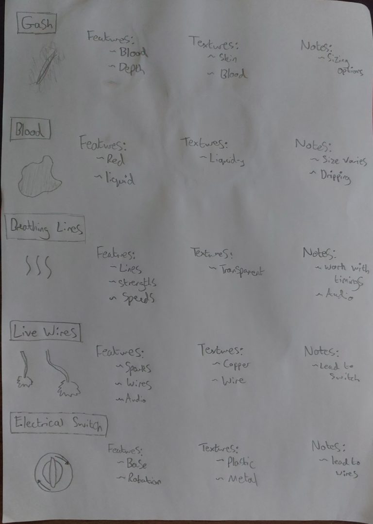
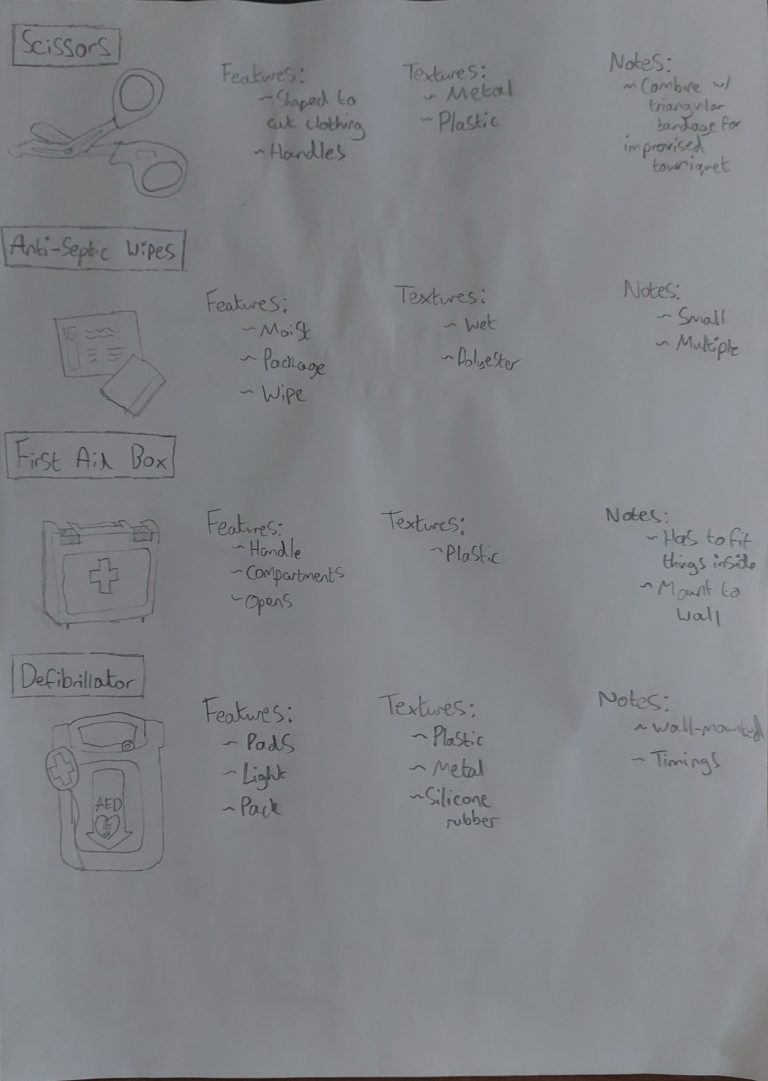
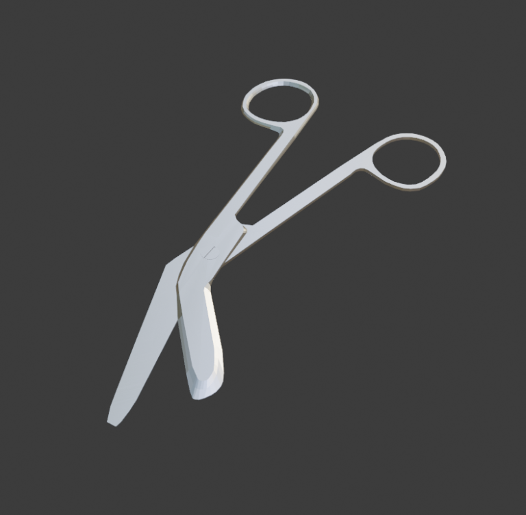
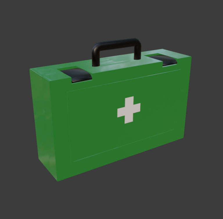
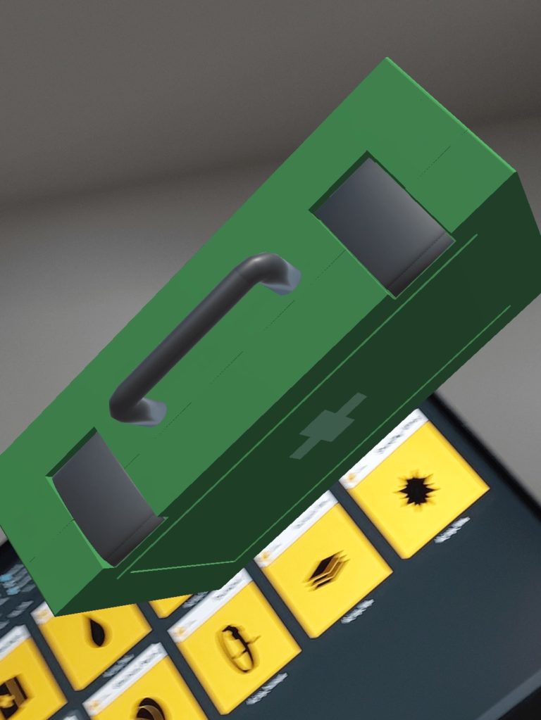
For the modelling side of the project, I created a list of the different equipment and features that would need to be included within the project, some of which would have animations further down the line. The models had to be the right colouring and also the right scale compared to each other, and so I measured a First Aid Kit box and made note of measurements to scale the other models around it in order to keep the dimensions realistic and true to the simulation.
An idea that didn’t make it through to further development was scanning in the basic Manikin and having the models mapped to it in interaction. It was agreed with the client that due to time constraints and even hardware constraints, this would not be something we focus on at this time.
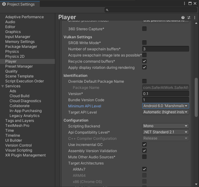
One last thing before getting into creating the design process was evaluating whether this project would support the Sustainable Development Goal 17 (SDG 17). To my understanding, this project would be supporting this strongly as it would offer a simulated environment for the course that could be taken anywhere in the world, and did not require immense equipment to run. Versions of android devices with software as early as Android 6.0 ‘Marshmellow’ and an API level of 23 can all run the AR software. This is the lowest Application Programming Interface (API) level for this project because that’s the “minSDKlevel”, Software Development Kit (SDK) level, set with the versions of software I am using.
Design Process
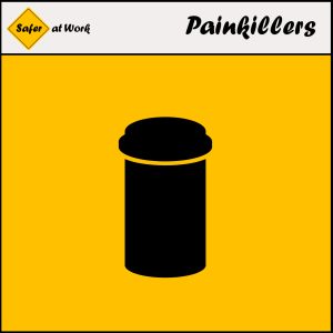
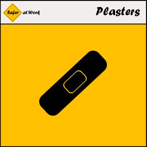
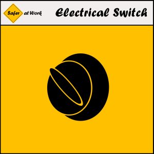
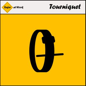
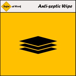
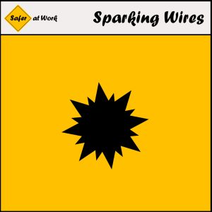
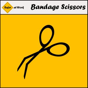
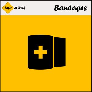
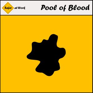
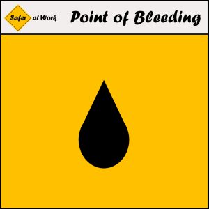
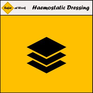
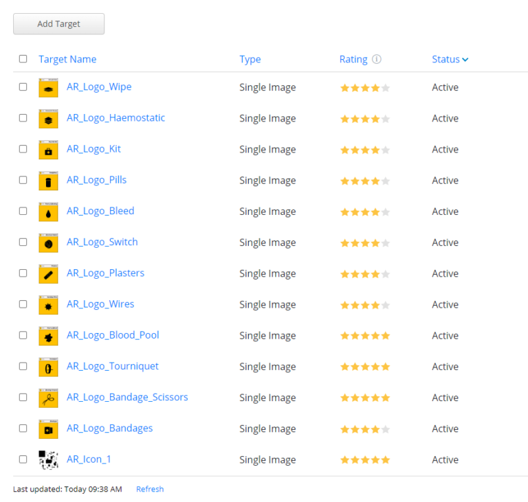
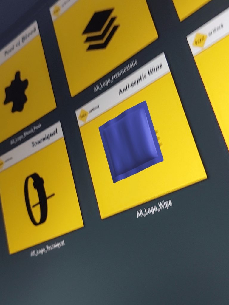
Designing the AR cards was a refreshing task to perform as it provided a new angle into the work I was not used to performing. I implemented the previously researched logo and colour scheme and played around with what worked best. The Yellow looked best as the main filling colour with the black working for the detailing and defining features of the cards. Remembering that the AR cards had to be both simplistic for user experience yet also detailed enough for the Vuforia recognition system to recognise them all well and uniquely, I tried different designs for each card. The Vuforia software has a rating system it uses to rank how recognisable image targets are, and so I had to test and see what the software ranked higher as the design process carried out.
The final designs of the AR cards each reached 4-5 stars on the Vuforia recognition rating system which was perfect as they also kept fairly simplistic at the same time. After sharing these with the client, more strongly positive feedback was given and further a comment was made that these designs slotted in well with already created signs and designs within their business.
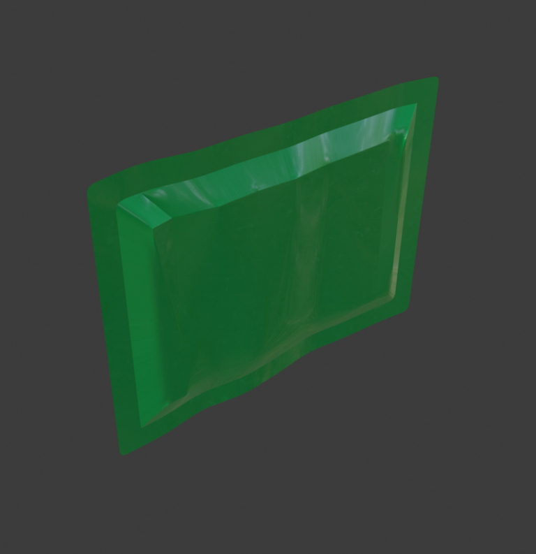
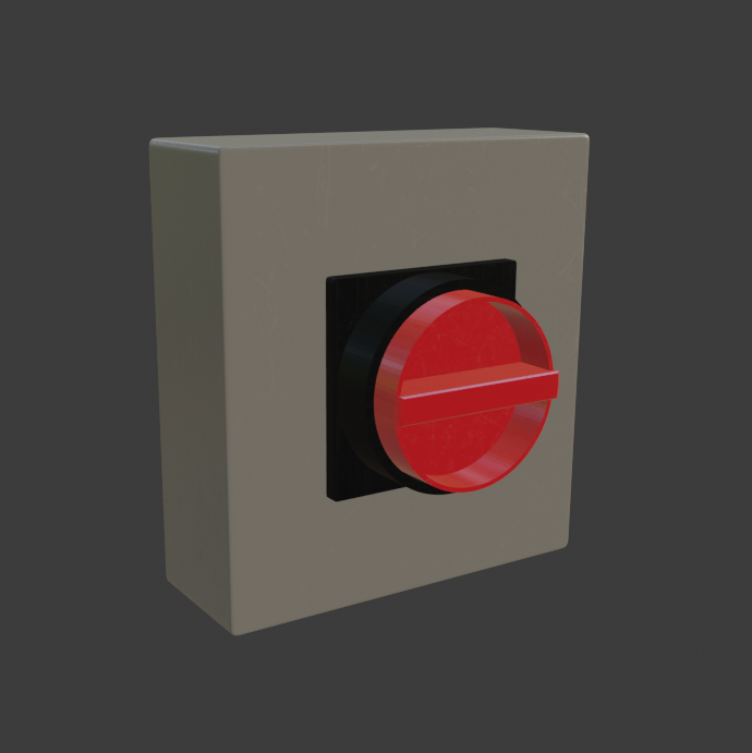
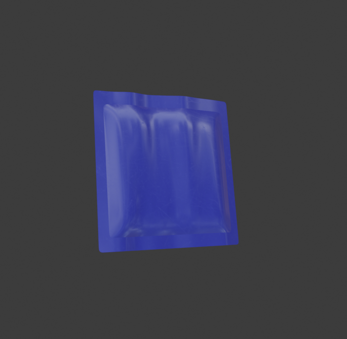
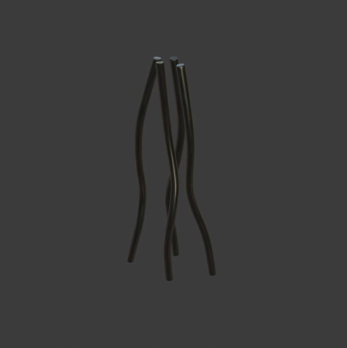
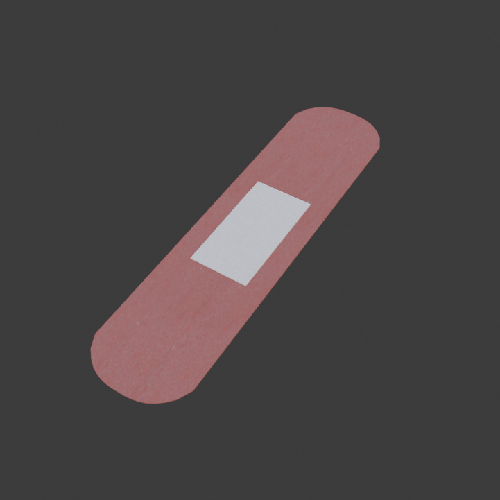
Designing the models was something I knew well, and with such a large database of reference images online plus already provided images from the GWO presentation, I could design these models with ease. The specific equipment required by the First Aid course ranged from Bandages to Tourniquets, and due to being important medical equipment, they each had very detailed measurements online allowing me to scale them appropriately. These designs were shared with the client and were agreed upon as realistic representations of their real life counterparts.
Modelling, Texturing & Exporting
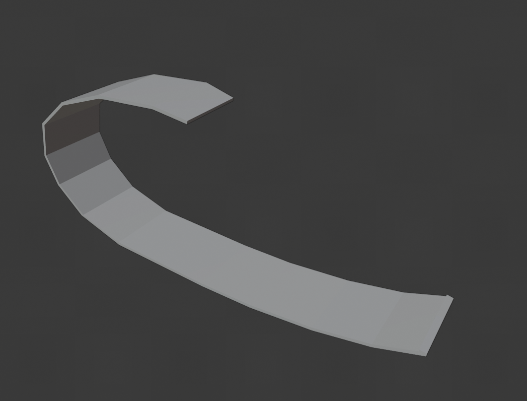
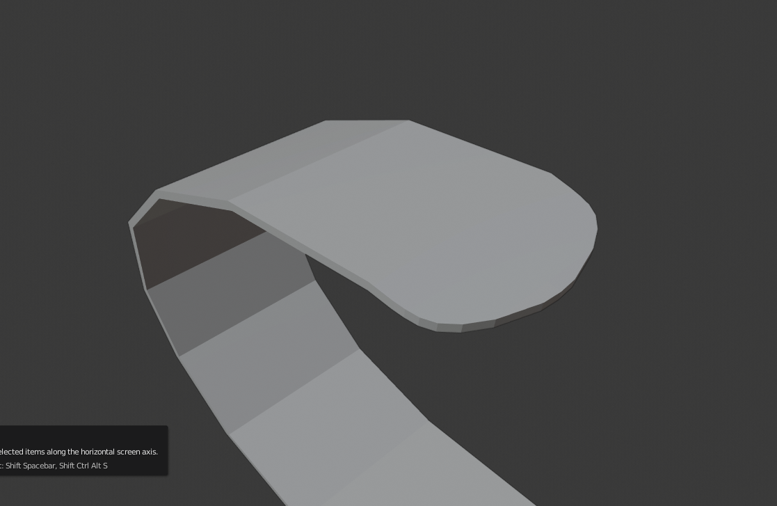
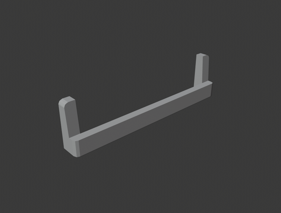
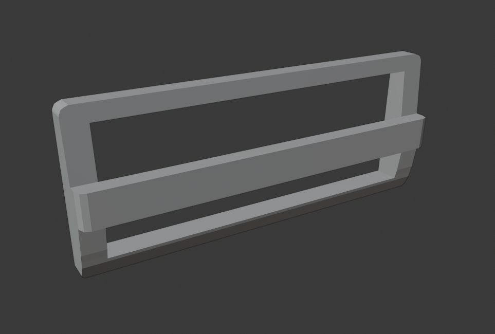
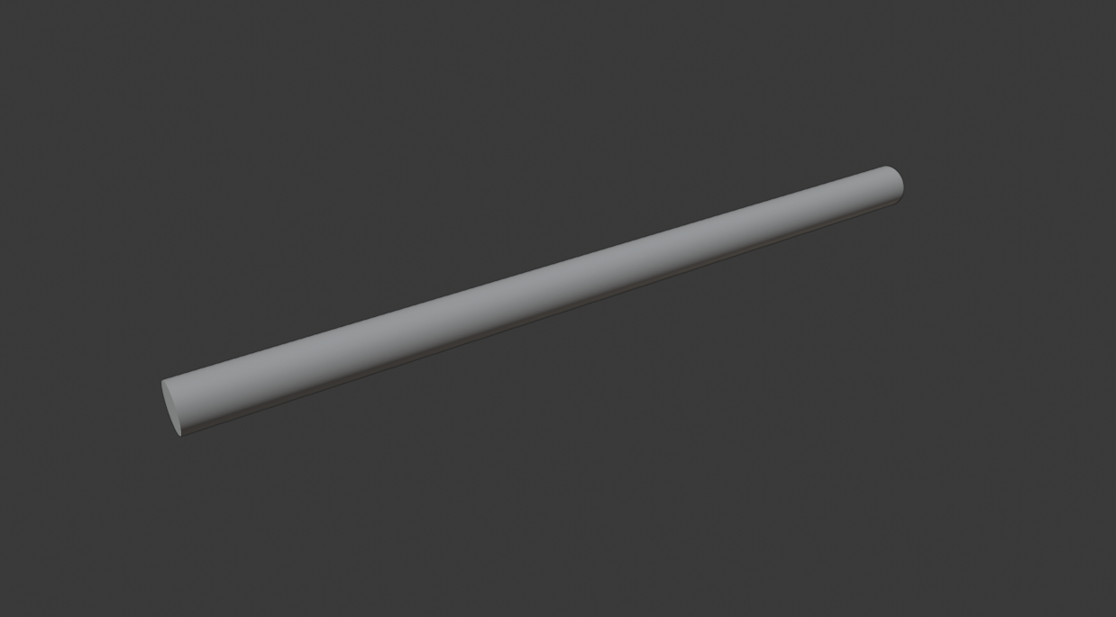
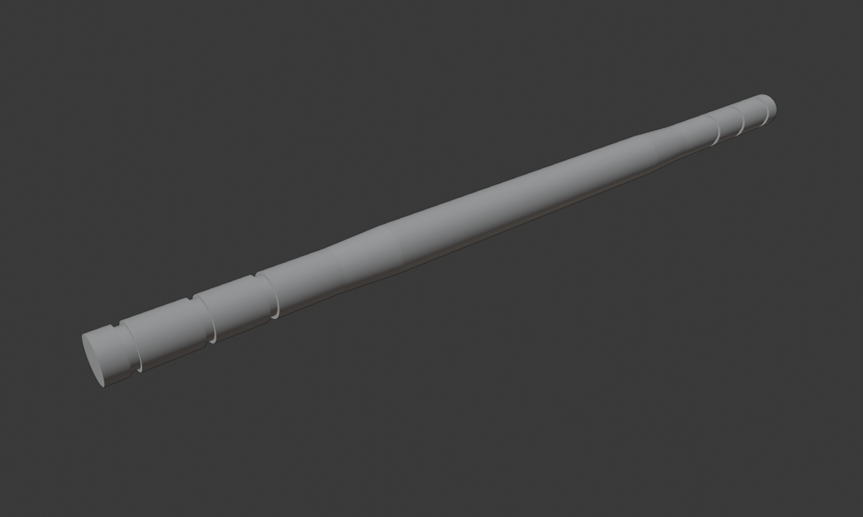
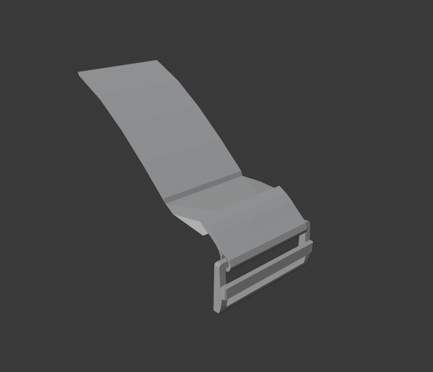
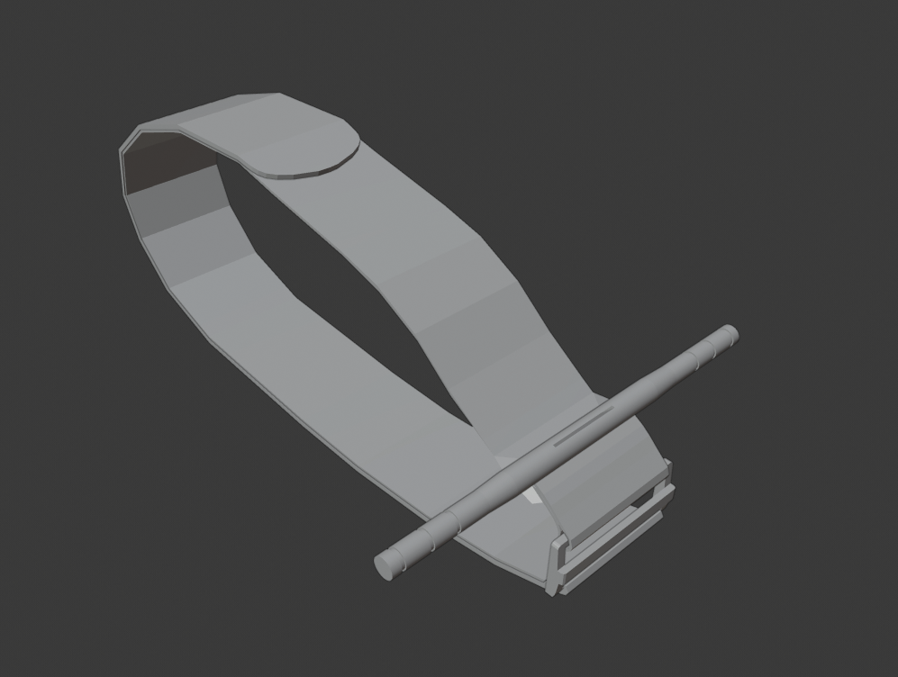
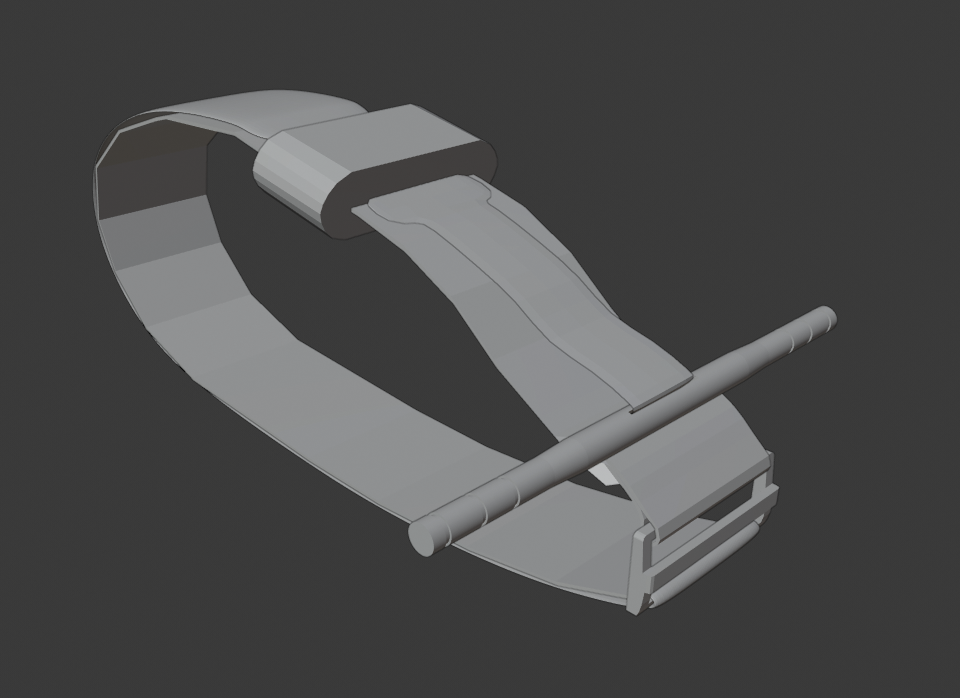
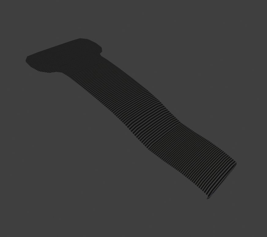
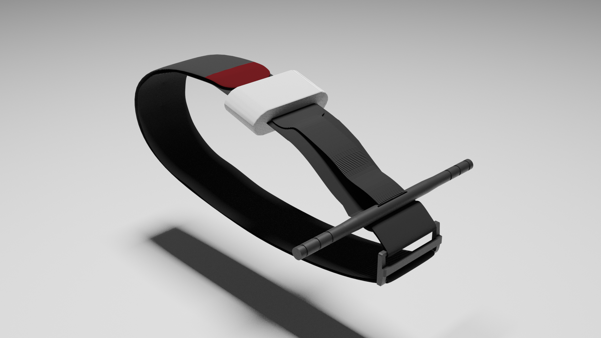
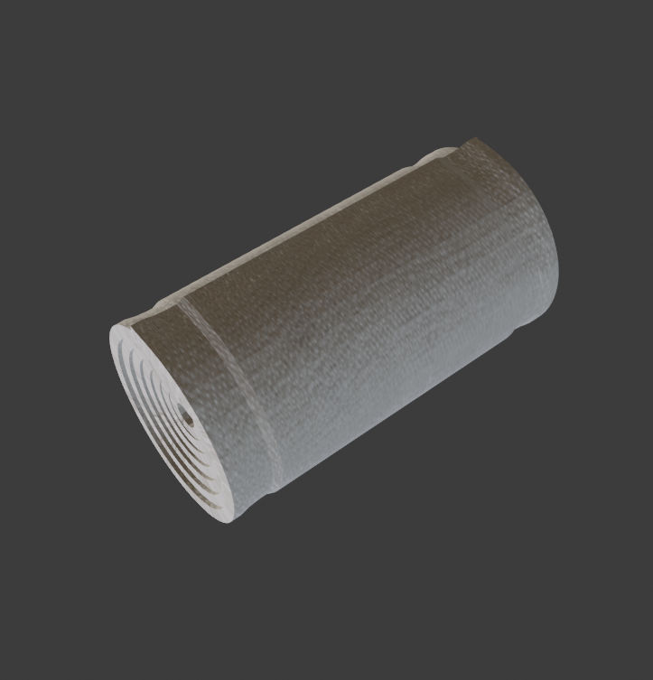
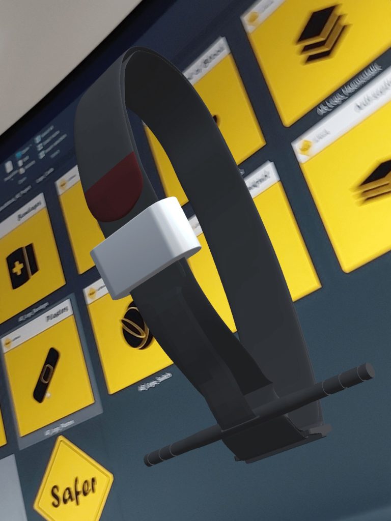
Making each of the models involved several steps; block modelling to scale, sculpting to the right shape, UV unwrapping and texturing. One of the more detailed models I worked on was a Tourniquet, a piece of equipment used for cutting off blood flow above a limb with catastrophic bleeding.
I began with creating basic shape placeholders of the different pieces of the model and placed them together matching their real life counterpart. In doing this, I was able to establish the right sizing of each piece before heading any further into modelling. The next step was tending to each piece, creating the right curving on the edges, managing the poly count and overall making the entire model recognisable as the Tourniquet. The final modelling step was to add modifiers to increase the realism of the model, and so I chose to use subdivison modifiers on the Windlass straps and Windlass rod to make the surfaces completely rounded. The model as well as others were shown to the client and they agreed that each was recognisable and ready for the next stage of development.
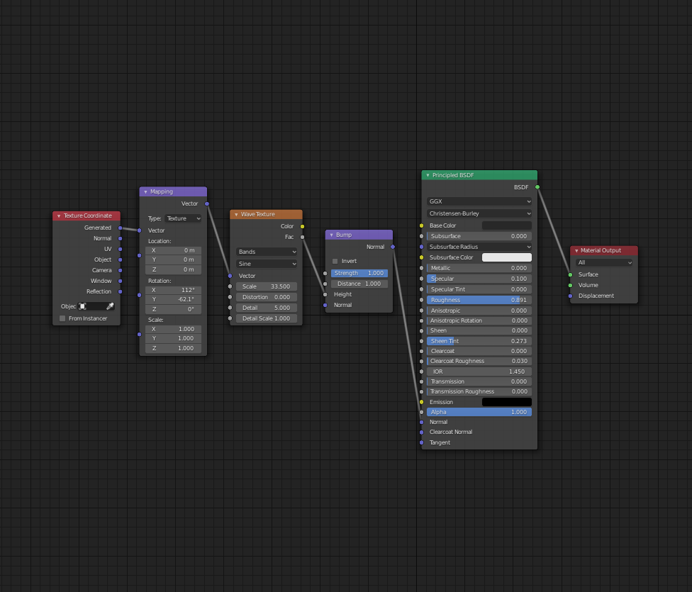
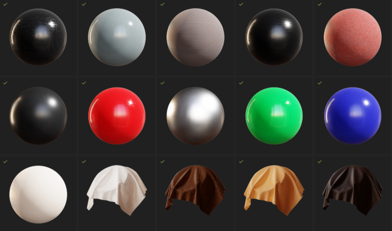
The texturing stage involved exporting textures and imperfections from Quixel Bridge into Blender ready for adding to the models. For some of the more heavy models (e.g. the blood pool) I used blender’s shading tool to make from scratch models with the correct reflections and detailing. The client loved the models with textures when shown to them, and praised the likeliness to their real versions.
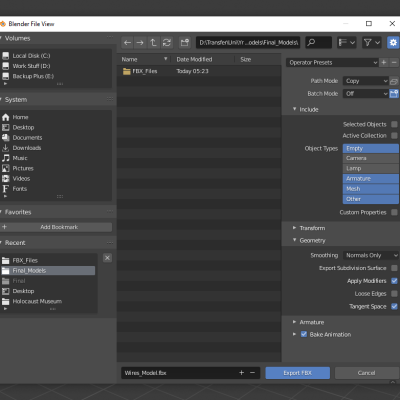
Exporting gave multiple options on file type, both with their own advantages but in the end, I chose to use .fbx over .blend and this is because of importing times into Unity. When .blend files are imported into Unity, they go through Unity’s own fbx exporter, and so to save export/import time .fbx files will be read quicker. In addition to this, I made sure to minimise poly count on the models and to bake textures onto the models where I could as the smaller the Unity project the better download speed as an APK down the line.
Using Vuforia in Unity
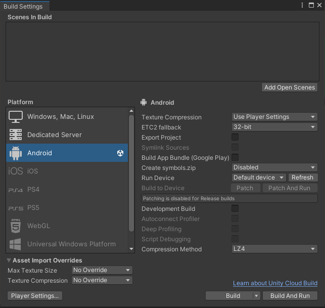
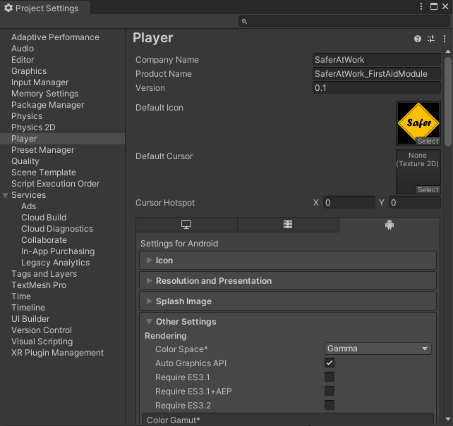
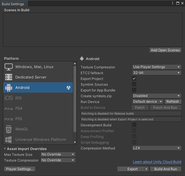
With all the textured models imported into the Unity file, it was time to prepare the file with the AR setup. The first step was to go into the build settings and make the file platform Android, and then in the player settings go to other settings and check the Minimum API level, making sure it is the previously stated Android 6.0 ‘Marshmellow’ setting. This has allowed the file to be built as an APK.
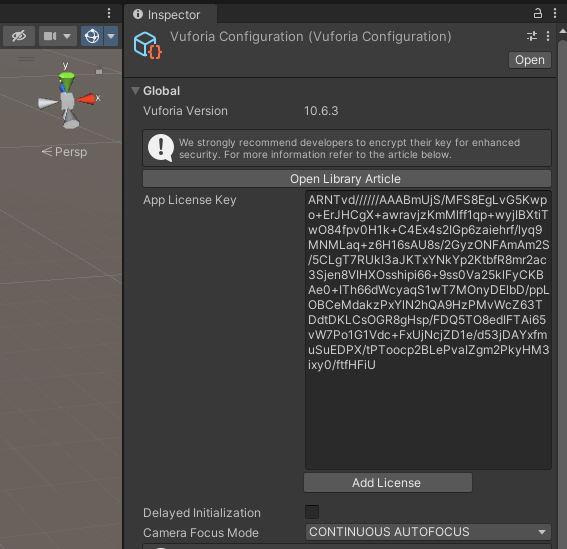
The next step was to add the Vuforia plug-in from their website and make an account. I had already made an account to upload the image targets to a database ready, so I simply needed to copy the license key, add an AR Camera into the scene and add the license key in the appropriate section on it’s ‘ Vuforia Engine Configuration’ settings. The added AR Camera uses the camera of the device the APK will be installed on to simulate the models from the recognised AR cards.
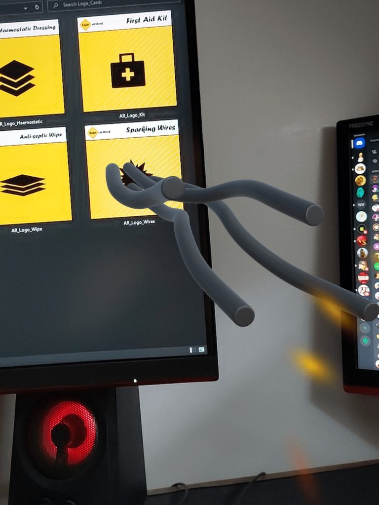
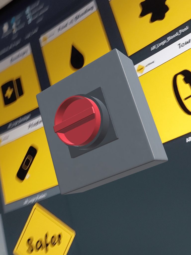
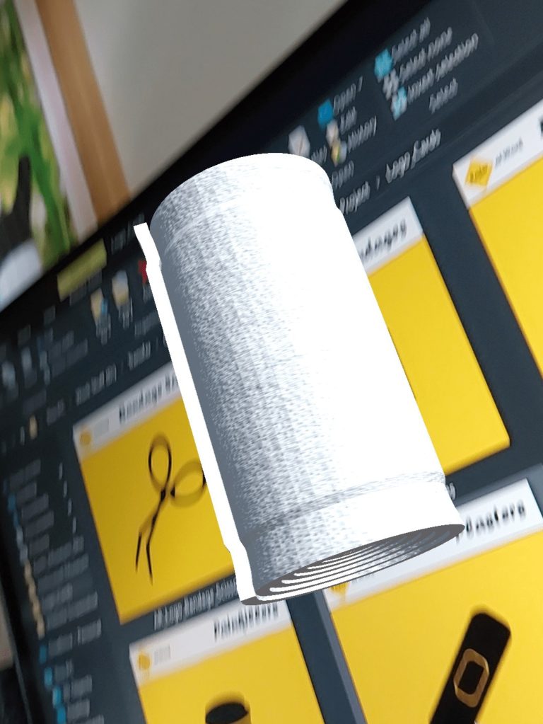
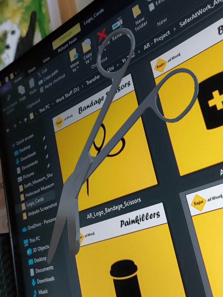
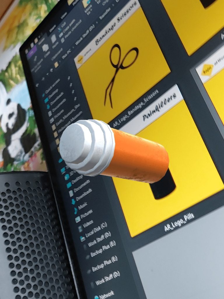
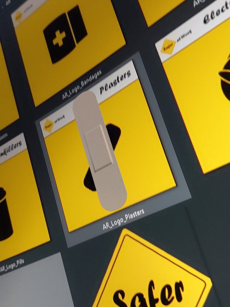
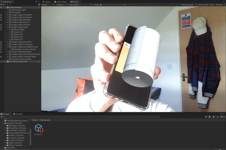
Leading on from the AR Camera, Image Targets were now to be created. Image Targets require the user to choose a database to select the appropriate Images from, and so on the Vuforia website Target Manager I chose to download the database to Unity Editor, and ran the Unity package file to import the database. Once imported, each Image Target was allocated their Image and the models were parented to them and placed on the AR Cards with adjusted correct scale. This was shared with the client as a progress update and demonstrated on the game view and they were very pleased and further offered feedback on speeds for the particle systems to be created for blood and sparks animations that will be parented to some of the models.
Testing, Fixes & Changes
Having everything included in the Unity file, the testing stage could now begin. There were 2 ways for the testing to be done and by 2 parties; within the game view in Unity and as a downloaded .apk file, and prototype tested by myself and the client. This allowed for us to see and alter the scale of the models a bit better, and to test the tracking of the AR cards by the software. By myself, I found that the pool of blood was still too heavy of a model to run without lag and so would need to compress it further, but the rest of the models including particle systems ran smoothly on both the game view and on the .apk. The client was extremely positive about the results at this point in the project, and had slight feedback on the flow of blood to mirror the factual blood flow the average human has. The .apk file worked on both mobile and tablet devices and picked up both online images of the AR cards and printed out copies too.
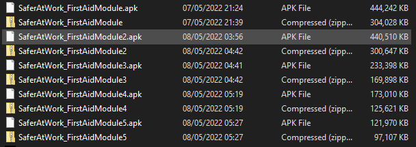
The download size of the .apk file was approximately 44mb which small as it is, however I tasked myself with looking for ways to compress it further to speed up download times and efficiency. Another tweak I set myself to make was to customise the application with a well-fit custom Icon from the client’s company logo so it really did feel like their software.
In the future, I would spend a good amount of time animating the models once interacted with by the user so they would map to a manikin and function visually as training for the course. Due to working alone on this project, I was not able to reach the point with it that I hoped to reach, however if I were to continue the project and expand it further, I would make it feel more like an experience and add text for the user to see pop-up where necessary. Basically to give the full interaction to the project and give it it’s true purpose for the client and their customers.
File Organisation & Handover Document
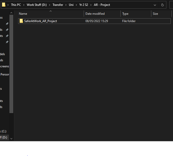
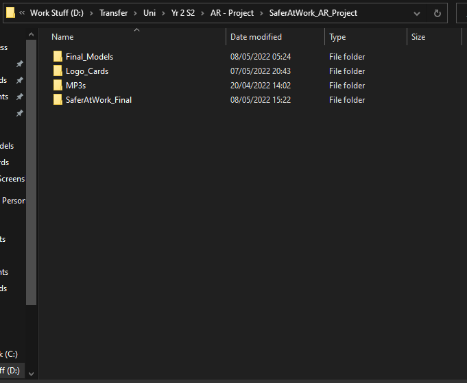
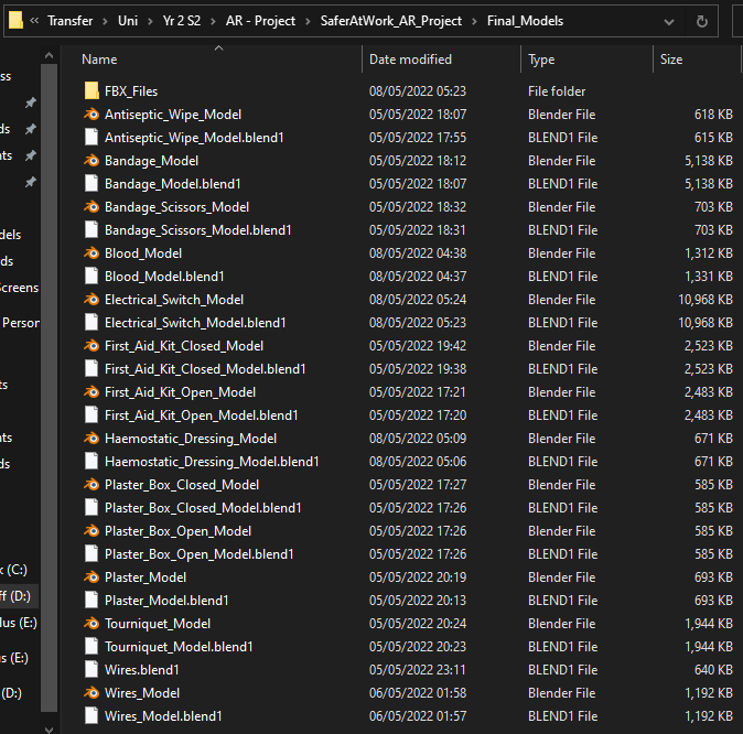
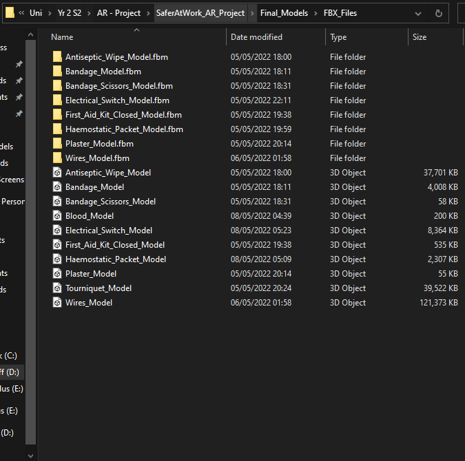
As this is a client project with plans for customers to use this software themselves, this needed to be professionally logged with files names appropriately structured for future development by any developer, be it myself or an outside party.
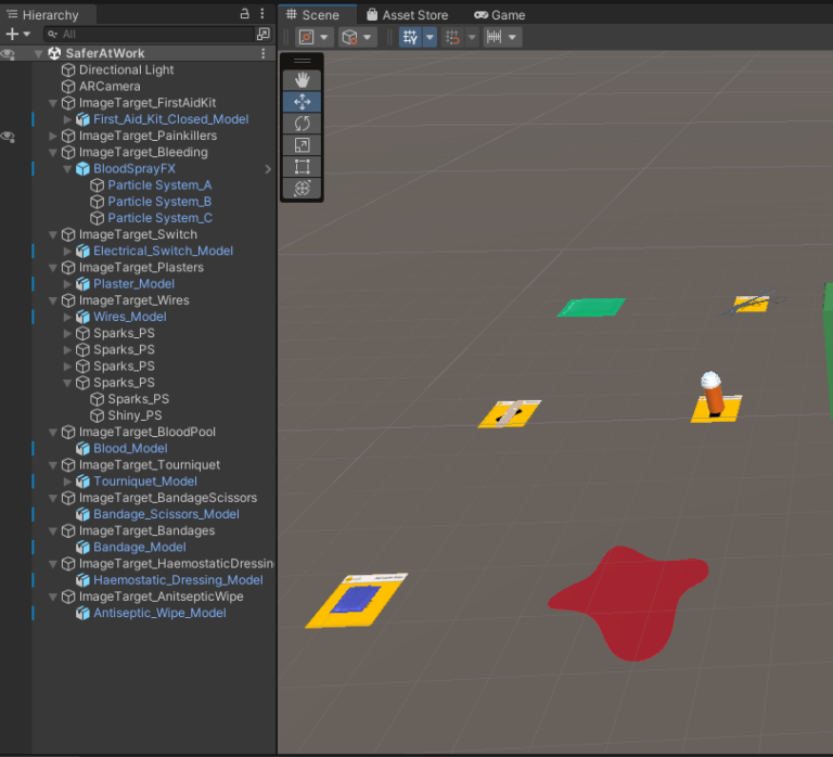
A fairly simple structure was kept throughout, and files were named, for example, Electrical_Switch_Model.fbx or ImageTarget_AntisepticWipe. This is very clear to read and understand and so minimising any issues concerning confusion for future development.
For the downloadable content below, they may say they are from an un-trusted source, click allow on these occasions and let your device open and run both the .zip file and the .apk file. For the .apk file, you might have to go into your android device’s security settings and allow unknown sources!
Download .apk file: SaferAtWork_FirstAidModule
Download Handover Documents here!
The Social Media Project
- INSTAGRAM - LINKEDIN -
Research & Goals
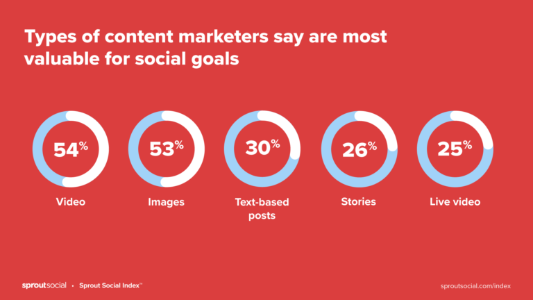
This project tasked me with creating campaigns for goals of my choice on a minimum of 2 social media platforms, and I needed to show the process from start to finish and evaluate how successful my campaigns were in meeting these set goals. The first goal I set was to create a set of connections with other members of the 3D industry, and get conversing with them as an investment into future 3D work, be it self-promotion through their already well established and followed feeds, or through potential collaboration on projects. My second goal I set was to build a following of my own consisting of other 3D enthusiasts and those with interest in the media I would be creating/sharing. I chose these goals because I plan on using these social media account to showcase my future work and to gain potential work and so I want to spend this time growing a presence. My target audience was
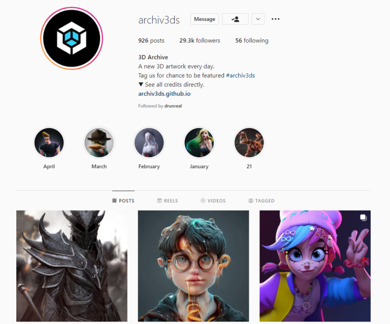
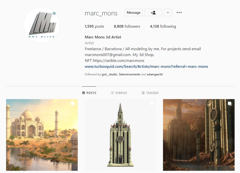
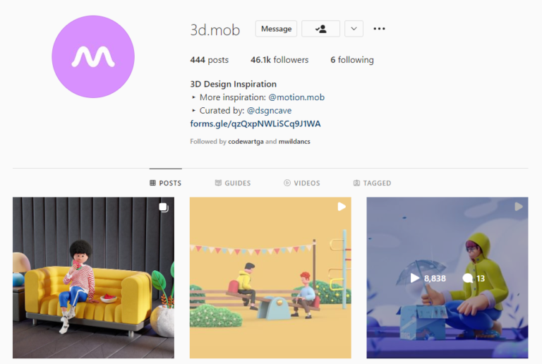
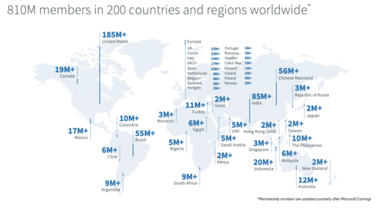
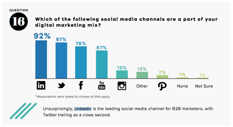
To start this project, I was tasked with choosing multiple social media platforms to create the campaigns for. Looking into the main contenders we all know so well, and some more obscure ones, I found that both Instagram and LinkedIn would be the most beneficial for me. I chose Instagram over other platforms because I strongly believe it suits my industry well. I am a creative working in the 3D industry, Environments to be specific, and so I understand that the work I will be showcasing and sharing is much more visual and imaginative, and so Instagram is one of the best platforms to do this as it functions as a heavily visual platform, with big image posts and a highly used video-sharing system in play. In addition to this, Instagram provides an incredibly large and diverse audience, with roughly one billion active monthly users. Also, the hashtag system allows you to follow threads with both large and small followings which is a great way to boost viewership with more specific audiences. My other choice of social media platform was LinkedIn, and I chose this one because it contrasts Instagram and has a much more professional and focused user demographic of employers and employees. Furthermore, due to the ability to filter so specifically the type of people you want to interact with, I can create a feed of 3D content tailored how I want, in the specific areas I want, e.g. AR/VR and Animation. I would spend more time sharing user-generated content on this platform as opposed to my own as I would mainly want to post finished projects here and not all the steps leading up to it.
To have a successful campaign I had to research the best methods to self-promote and expand my interactivity from users. One of the methods I found was specific posting times. Multiple sources indicated a schedule of the best and worst times to post weekly, and how often to post within those weeks. The issue I came across, was that each source had a different approach and they all saw clear results, so I did not find much help in this, therefore I decided to find out for myself within my own schedule the best times to post and how often. Another method was to have a good sense of branding within my posts and following. A large amount of well-received accounts had colour schemes and original logos for their profiles, however I am not a design student and was not sure how I would like my brand to look. One thing I could take into my own profile though, was making a theme within my posts, for example every line of posts consists of 3 posts, and so I make every 3 posts fit together well, be it in design or in project area. This would show easy to track and attractive documentation of work for followers, potential employers and peers.

Planning
Coming into the planning phase of the project, I was able to start outlining a schedule of posting dates and times, milestones I would hope to reach and using the researched methods of attracting interactivity to my accounts.
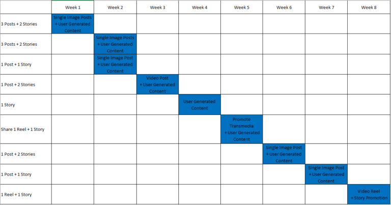
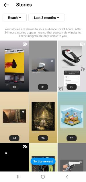
The schedule of posting dates can be seen above and details the planned times and type of content being posted on those days between March 12th and May 8th (8 week period). As can be seen within the schedule, I would try multiple shorter schedules for my posts within the 8 weeks, each differentiating post frequencies to gain an understanding of what works best with my target audience. I planned to post my content typically between 8-9am each posting day as I had read that posting early, before everyone is actively awake using their own social media, throws your post into their feed when they first load up their different platforms, maximising reach. In addition to posting actual content, I would share other users work and promote their styles within my Instagram Story in order to receive their attention and interest within my own account, creating a sort of 2 way street that can benefit us both.
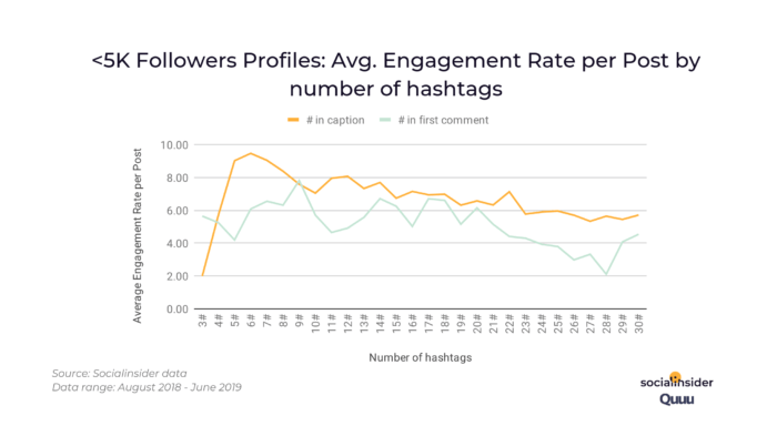
I concluded from my research that hashtags would be playing a major factor in drawing interactions to my posts and so I created a list of 20-30 different hashtags that I wold use depending on the post. I would only use between 10-15 on the posts however, as this was indicated within my research as most efficient at gaining reach in both the Instagram and LinkedIn algorithms. Each of these tags had some relation to my area of the 3D industry (environments) and the software being used.
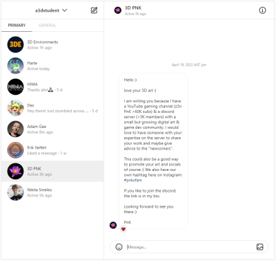
One last way to increase user interactivity and meet my goals of making connections was to directly message accounts of similar nature and show interest in their own work, praising it and asking them questions. This creates the base of a bond between me and them, and provides a connection that could be expanded on at any point for promotion of work or business enquiries. Moreover, showing activity with your own followers creates a sense of community and creates a loyal following with the most closely-minded accounts interacting more.
Interactivity
After having my account up with consistent posting for the period of 8 weeks, I could now look at where my interaction came from and with the different types of users following my account. Each social media platform had unique predominant methods of interaction and so it was best to look at them seperately.
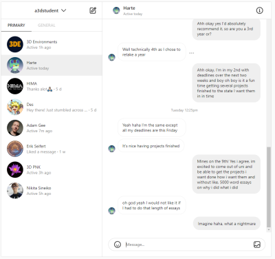
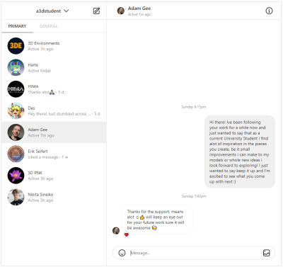
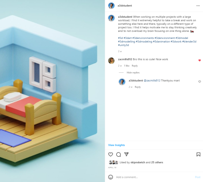
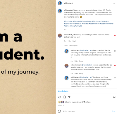
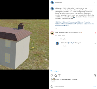
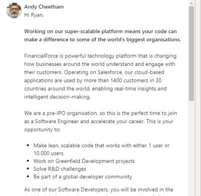
For Instagram, most of the interaction with my account came from comments and direct messages with users. For instance, on one of my posts introducing my account a user who also owned a 3D industry related account, and further an environments account (like mine), commented asking what 3D software I would be using to create the work I would be showcasing on my account. This spun into a back and forth about the different software we both use and created a connection with this user. I can further prove a connection was created here as we actually had another conversation at a later date in direct messages, praising the work we were each showcasing. Speaking of direct messages, I sent out messages here and there to already established 3D accounts on the platform, one of which being an account that my personal account had followed for quite a bit of time previous to this project. To my surprise they reached back out to me with support to my work and future endeavours, and followed my account too, creating a connection that could prove very promising for me professionally down the line.
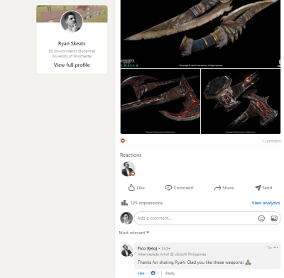
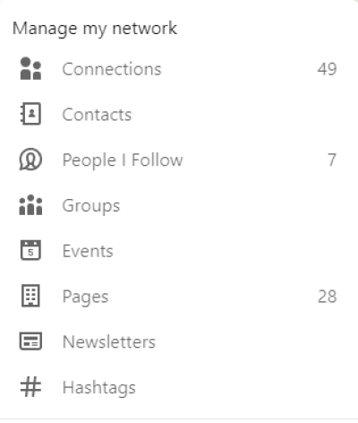
For LinkedIn, there was considerably less interaction, yet still some to point out. For instance, I shared a lot of other users content on this platform trying to tailor my feed and following to be mainly users I would/had already interacted with, and one of the pieces of content I shared was created by an employee for a games company I follow called Ubisoft, and further from their Philippines team. The creator saw my sharing of his work, gave it a heart react and commented thanking me for sharing their work on Assassins Creed Valhalla. They proceeded to request to follow me before I even thought to request them first, which is a big success.
Analytics
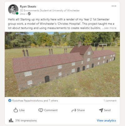
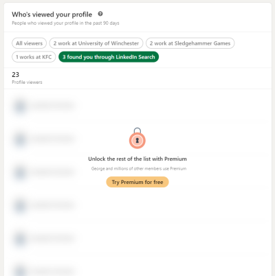
LinkedIn did not offer an immense amount of information on the analytics of my campaign, part of this was due to there being a premium subscription that had to be paid to see most of them. For example, an aspect I would have found very informative that I can see locked in the analytics is profile searches, searches carried out specifically looking for my account and posts. From what I can see, my posts hadn’t had too much engagement apart from my first post which raked in 309 impressions since its upload in mid march.
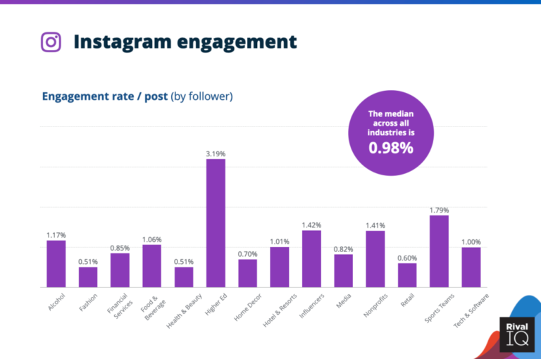
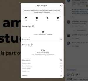
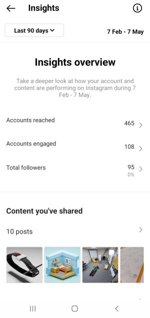
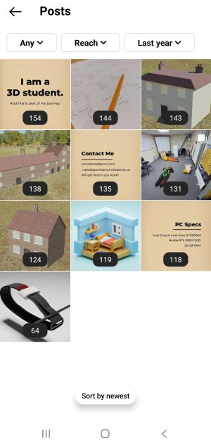
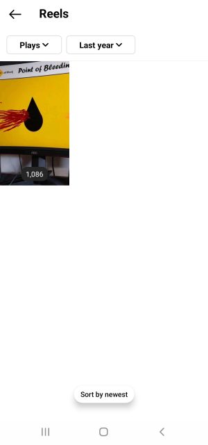
Moving on to Instagram, I was able to gather a much more informative and wider range of analytics on my campaign. Over the 8 week period I reached 465 different accounts, with 108 of those accounts engaging with me in some aspect, be it comments, likes or direct messages. That’s a 23.2% rate of engagement, and although it doesn’t look statistically impressive, it’s a good start to a growing account. Researching the average rate of engagement for any account on Instagram, be it a corporation, a celebrity, or an influencer below 1000 followers, it was a shock to find that the average rate is between 1-5% maximum, a figure that is slowly declining over time also. In terms of interaction with potential connections, 3 in 4 accounts I reached out to within direct messages replied and in half of them a conversation was had, expanding upon any base relationship with these other 3D creators. One fact i came across was that on almost every post, most impressions were gathered by the hashtags I had created and followed, almost doubling the 2nd best route of impressions each time.
Campaign Evaluation
In short, I have come to the conclusion that my campaign was successful. If we go back to my goals, we know that they were to create connections and to build a 3D-oriented following. Although LinkedIn proved less effective for this campaign approach, Instagram offered great interactivity and analytics to reinforce this. Not only did I create connections with other 3D members and accounts that could promote my work, but I also created an engaged following of like-minded 3D creators staying for the ride, meeting both goals. The interactions had on both accounts were both purely positive with no issues or hate towards any aspect appearing. I can see from my analytics of posts that the best format for posting was twice a week in the early morning, with the exact days not changing engagement much in any way, and furthermore hashtags played a much more important role than I anticipated.
I have learned that Instagram provides a more engaging environment for creatives due to many factors; the platform is heavily visual, the hashtags each have their own communities, 3D creations are one of the most engaged types of original content on the platform and it is simple to have and share a thread of comments with multiple accounts. I have also learned that although LinkedIn did not gain much engagement and reach, it offered a very precise audience for my showcased work and shared content, with 85% of followed accounts being in the 3D industry, which is a very large amount.
If I were to improve upon this project in the future, I would give making my own brand, logo and colour scheme much more attention, and also look into creating a presence on ArtStation where 3D industry is the main focus almost completely. I would also spend more time making finished original content for LinkedIn to try and boost reach.
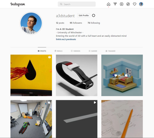
Instagram: a3dstudent
LinkedIn: Ryan Skeats
The Earth Museum Project
- BLENDER - QUIXEL BRIDGE -
Client Brief & History
The client for this project was the National Holocaust Centre and Museum, and they promote an understanding of the roots of discrimination and prejudice, and the development of ethical values, leading to a greater understanding within society. They do this with their showcase of the in-depth history of the Holocaust during WW2. The client brief wants us to develop models of real life historical counterparts that will be added into a worldwide virtual learning resource called ‘The Earth Museum’. Also, they asked for models to be in a .fbx file format, with textures no larger than 2k resolution. The target audience was KS3 and KS4 students (12-16 year-olds). The timeframe for this project was again, a 12 week period over the semester. I chose to use Blender as my 3D software, and Quixel Bridge for textures as these are both softwares I hope to master.
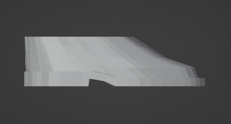
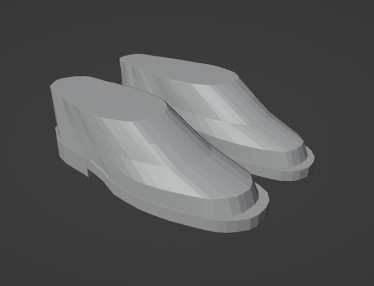
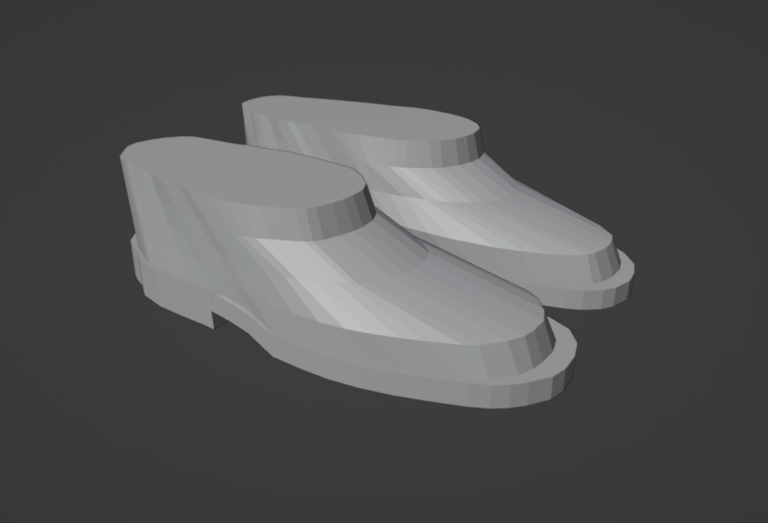
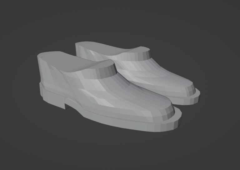
Modelling & Texturing
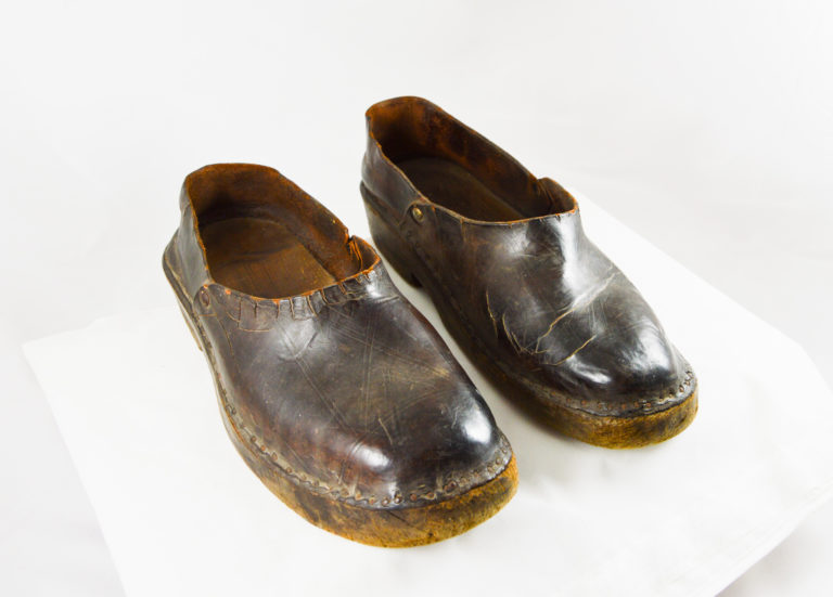
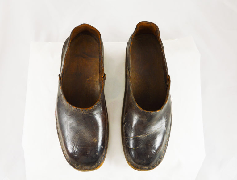
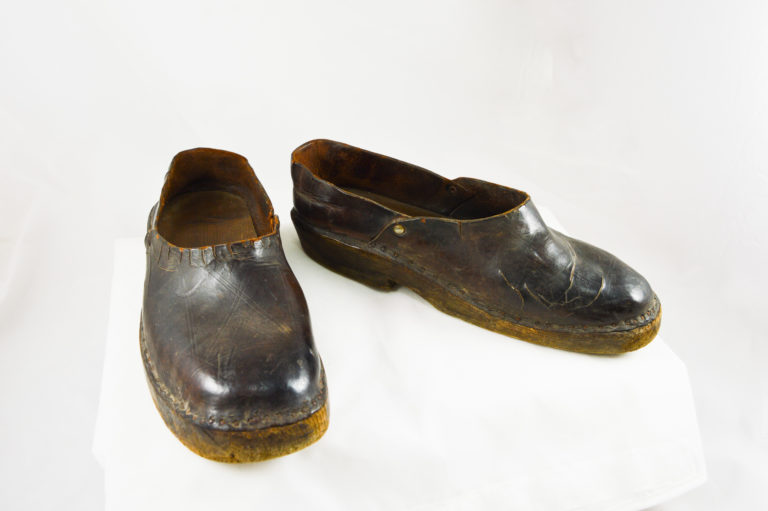
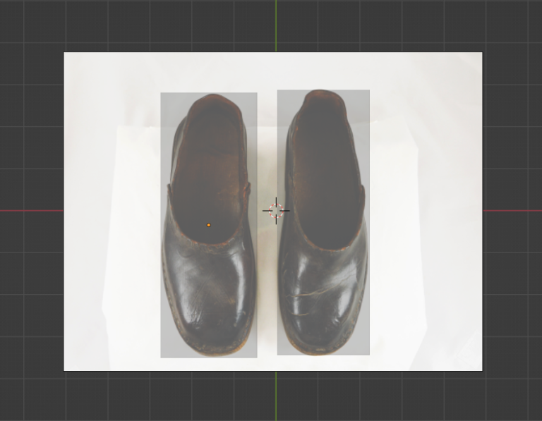
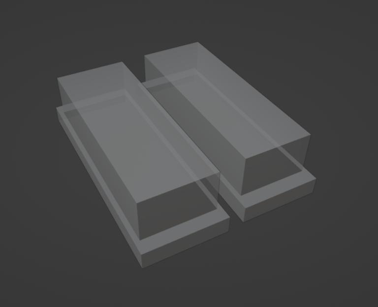
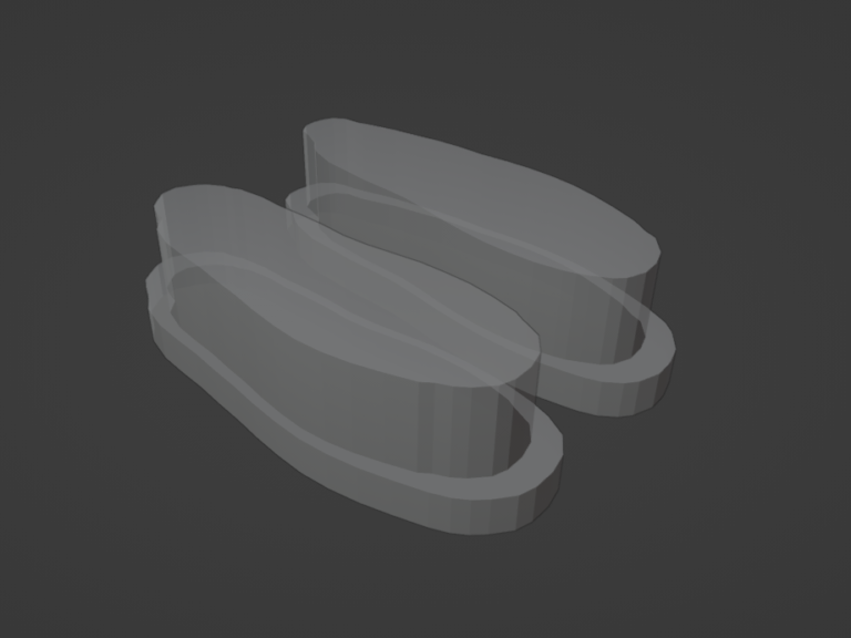
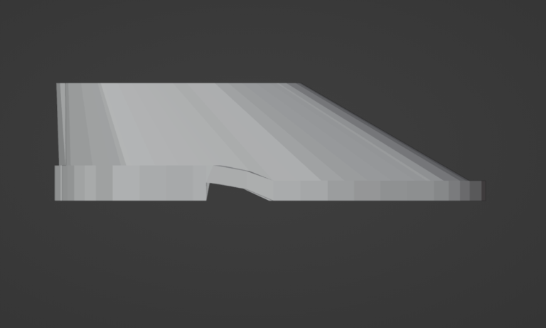
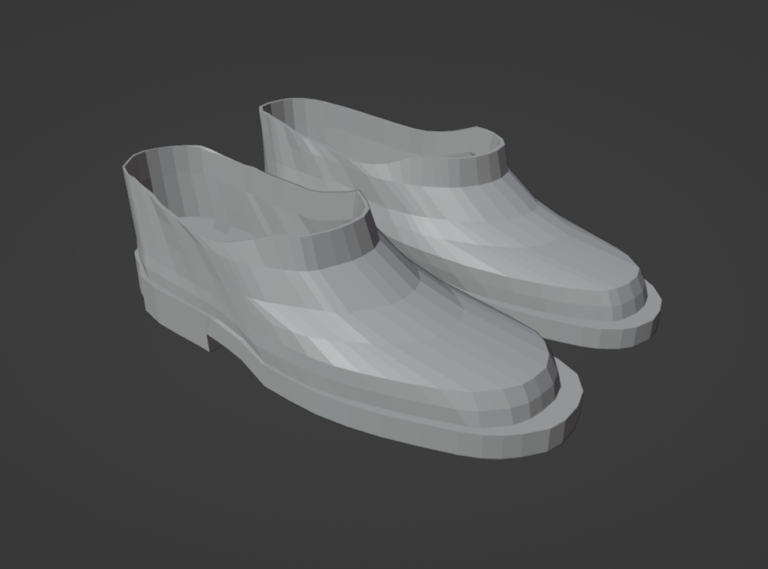
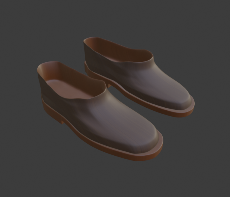
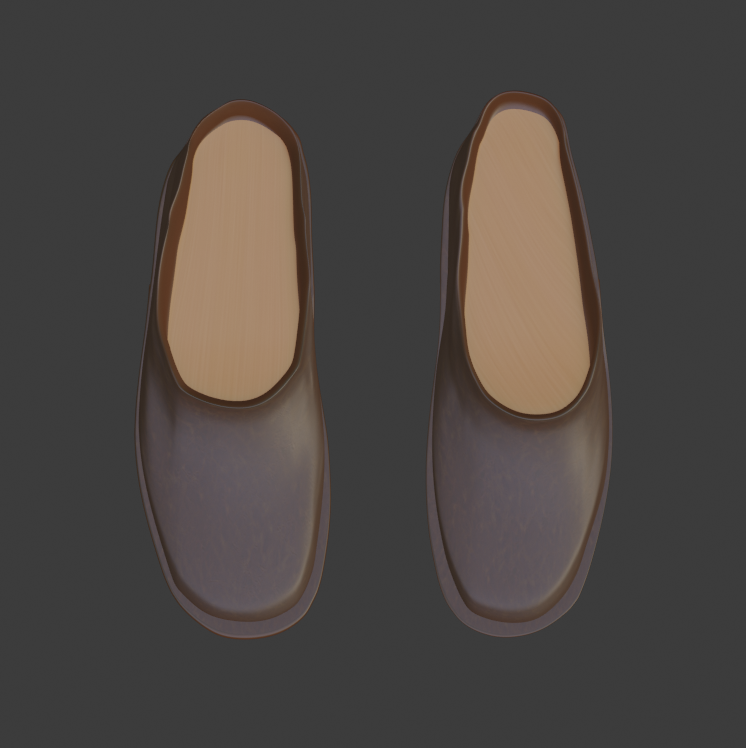
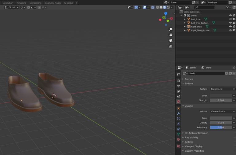
Making each of the models involved several steps; block modelling to scale, sculpting to the right shape, UV unwrapping and texturing. I began with a block model made over the reference image of the shoes and step-by-step, as seen in the images on the left, sculpted the shoes into the correct, realistic shape. Next, the modifiers needed to be added; subdivision surface modifiers to create the smooth surfaces and the bevel modifier to round the edges.
The texturing stage involved importing several types of leather from Bridge and adjusting each to see what suited the model best based of the real thing. After selecting the right leathers, these were baked onto the models with a 2k resolution each and thrown into cycles to begin looking at lighting for renders.
When showing the model progress to the client, they gave positive feedback to the realism in comparison to the real shoes, and offered advice for tweaks to be made with the darkness of the leathers.
One positive of working with a group was that we were able to share each others models and provide feedback of our own, giving plenty of space for improvement. From this, I gained a multitude of perspectives on any issues I was having and tackled tasks more efficiently. One limitation however, was that because we each seperately worked on our own models and only researched our own, it became hard to give detailed feedback in some cases as we did not know the backgrounds of our peers’ models. If I were to go back and do something differently, I would have scheduled more meetings with the client, as there were only a rare few that were had, and I understand how important client feedback is.
Rendering
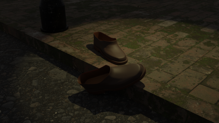
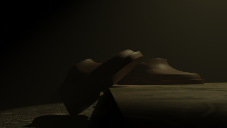
This Stage of development provided the finishing touches to this project, giving the model a fitting environment to interact with. These shoes were from a dark time in history and so I wanted to give them a gloomy atmosphere, adding in fog and darkness around them. I imported more textures from Bridge to create the path and road the shoes would be sprawled over and created a spot light with a yellow tint over the scene resembling the dim light of a street lamp.
The render was in cycles and had a Render setting of 256 and a Viewport setting of 64. This is quite a high quality render because I wanted to give the historical model as realistic of a scene as I could, offering it the most resemblance to the 1940’s. The client enjoyed this environment in the renders, and asked for the models to become more ravaged by time. Due to time constraints I was not able to perform this, however this is something I would work heavily on in the future.
File organisation & Handover Document
As this is a client project with plans for future development, this needed to be professionally logged with files names appropriately structured..
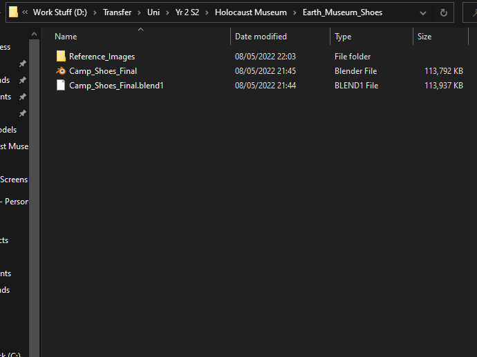
A fairly simple structure was kept throughout, and files were named, for example, Left_Shoe_Bottom. or Camp_Shoes_Final.fbx. This is very clear to read and understand and so minimising any issues concerning confusion for future development.
Download Handover Documents here!
