The Mobile Device Project
- BLENDER - ILLUSTRATOR -
Planning
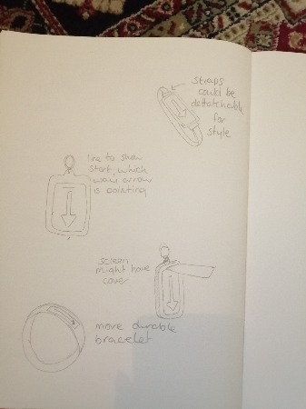
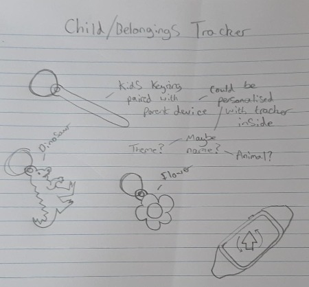
We started planning the mobile device with a long brainstorming session of many different ideas for each category that the client brief wanted us to follow. We had many different unique ideas; however, our favourites were following the category of its main use being for events. We originally had the idea for an AR device that would stick on the inside of car doors for travelling children where they could alter the outside world to look much more colourful and display dinosaurs and mythical creatures to brighten up long journeys. But when realising this was very limiting for the 3D student in our group (me) we changed up the idea to the Off-Track Bracelet. We thought of the idea of a Bracelet that would connect to other bracelets or paired keyrings through long range syncing, so that if one were to lose track of where a person or item was, if another off-track product were connected then they could find it with ease using the compass-like interface of the bracelet. A range could be set on the bracelet so that if a paired device was to leave that set range, then a notification with a vibration would occur and inform the user of the problem. We liked this idea because we realised that although it would help stay aware of the location of personal items, it would also be extremely useful for parents or teachers with their kids on trips as they might get lost in crowds and unknown places.
Design Process
Ethan and Phoebe were the design students in our group, and they got straight into designing the logo, the UI and the look of the bracelet and keyring for me to model. Whilst they were designing this, Sinead got working on the design of the website she would be creating in order to advertise the products because, due to Covid restrictions, we would be unable to meet-up and physically create the product in class with the right equipment. The designs were created and improved upon over the duration of a few weeks and gave a very strong idea as to what our product and website advertisements would look like. Furthermore, I myself got involved with the design process and gave feedback on the bracelet and keyring on ways to make them look more unique to our new modern brand, whilst following conventions for a popular, successful product.
Stages of Model Creation
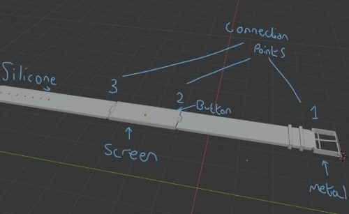
To make my way from looking at the designs of what I would be modelling on Blender, to creating and rendering their final models, I had to go through several stages of development. Firstly, I began by adding the basic meshes into the blender scene that I would be modifying into the right shapes for the bracelet and keyring, which consisted of several cubes for the straps and screen of the bracelet, and cylinders to create the metal links that would attach the straps to the actual screen of the device. For the keyring I simply needed and sphere for the sync-able device and cylinders for the rings making it a keyring. After this, I got to work on altering the shape of each mesh, making sure to curve the ends of the straps with a larger amount of loop cuts so that there would be a much smoother looking curve with higher resolution end results. In addition to this, for the sphere of the keyring I also created a larger amount of loop cuts so when I stretched it, it would have a smoother curve too, assuring better quality for the final result.
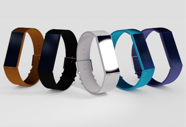
Once the right shaping was created for the models, I now had to connect the different pieces of the bracelet model and make sure that they fit into each other how they would if we were going to 3D print the pieces, and once the right sizes were given to each piece assuring they would fit, I could move onto that final phase of development. This would be creating and assigning the right materials to each piece of the products. For example, the straps of the bracelet were planned to be silicon and so I needed to assign the right qualities to the material so that it would not reflect almost any light and have quite a rubbery texture. In contrast, for the metal of the keyrings, screen holder and the links, I needed a fair amount of reflection by giving it a higher metallic value and making sure the colour would be a shade of grey like real metal. The colour of the bracelet straps and keyrings was variable depending on the colours we would choose for the different models, and so after assigning the material qualities I would duplicate the model but with different colours ready for a future still render.
Rendering
My plan for the still renders I would create to advertise the Off-Track products would be an apple-style image with a white background and 5 or 6 examples of the bracelet neatly laid out in a V shape showing them off in a sleek style. In addition to this, I would add a white light reflecting onto the bracelets at the perfect angle to add a level of realism to the render and I believe this extremely improved the photo-realistic effect I wanted to go for. For my other still render I created, I planned on having one of the bracelets outside in the dirt showing their connection to being useful in outside events, and although the idea for it was high quality, due to limitations of my computer’s components, I was only able to render a medium level quality dirt particle system with a 2K resolution HDRI for the lighting system in order to be able to render the scene without my computer crashing and losing the work. To counter-act the loss of quality, I added a blur effect to the scene so that the lower resolution dirt would be less noticeable.
Final Product
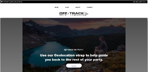
With the final renders complete, and the design students having finished the product logo, packaging and UIs, and the dev student having finished the website creation, we were ready to launch our combined efforts in our professional level advertisements. The following link heads to the Off-Track official website: (waiting to be sent link from group member).
The Isometric City
Project
- BLENDER -
Planning
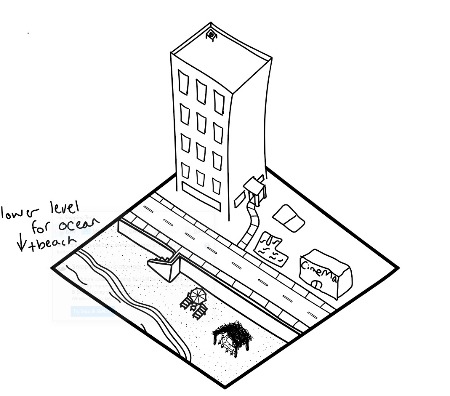
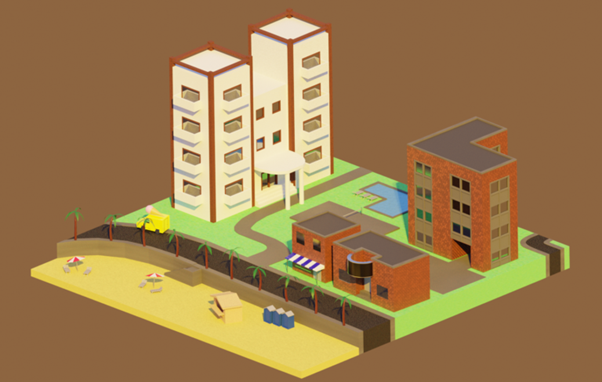
The main solo project for the 2nd semester involved the creation of a City Block in a style of our choice, with the client brief requiring it to be in isometric view with 3 levels of detail and a lighting system reflecting the time and area of the city. When brainstorming ideas for the type of city I wanted to create, I had a couple ideas that I liked above anything else, including a candy city with a very cartoony feel, and a Dead Island inspired holiday resort city. I ended up choosing to stick with the Dead Island inspired idea, however I looked more into the holiday resort side of things than the gory video game feel as I felt that I could accomplish it more realistically with my current level of blender knowledge. To further develop this idea, I was set on giving the resort a late evening summer feel because that is the atmosphere I enjoy most.
Design Process
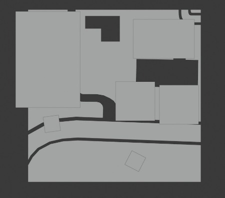
When it came to designing the city and its different features and materials, I created a simple block model in blender of where different buildings would go and what they would become over further development, and I named each block depending on what it would be also. I also researched online the different styles of holiday resort buildings and what materials they are built out of, and I found that the most modern resorts love to use painted white stone with treated wood as the bordering for walls, windows and doorways and such. Furthermore, I thought of extra items to place around the scene that would be found at any beach side resort like for example, beach chairs and umbrellas, and a wooden shack type bar down by the tide.
Stages of City Creation
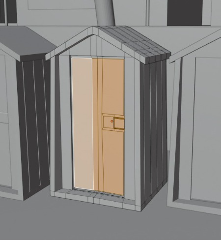
To make my way from the block model I had created as a base, to creating and rendering the final scene, I had to go through several stages of development. Firstly, I began by creating the textures on an external test cube mesh. Due to having planned out everything that would be in my scene, I knew exactly what textures I needed for everything, and so I got to work creating them all. The most complex texture I created was going to be the grass texture as I was going to add a hair particle system to really give the effect of real grass. However, when I went forward and created this and then added it to the appropriate places on the scene, my computer simply could not handle it as there was far too much to render, and so I had to remove it completely to resolve the issue. After this, I started to shape the buildings into their real-life forms and gave them all personal touches that clearly showed what their function was in this holiday resort setting. A large amount of extruding was used to indent surfaces where windows and doors would be placed, and loop cuts played a massive part in using symmetry to make everything look more like real life architecture, which was important for my scene. Some edges like the front of the ice cream van and its tyres needed the bevel tool to be used in order to give a smooth curve, and further needed a subdivision surface modifier for the to-be-added HDRI lighting to reflect off better. Once the overall shaping was given to everything in the scene, I moved into adding finer details where they were needed, for example, on the porta potties on the beach I indented surfaces and gave a clear outlining to the doors and handles to make them look more fitting to the scene than just blocks of blue and white. In addition to this, I also went into further detail with the shape of the palm trees by making the leaves curved planes with very detailed spiking like the real leaves would have, and extruding portions of the tree trunk getting bigger as it goes down, also mirroring its real-life shape. Once the final model was created, I added the appropriate materials to each surface and tweaked them depending on whether some were to large or small on certain surfaces, and then I was ready to head into lighting and rendering the scene.
Lighting and Rendering
As touched upon before, the atmosphere I wanted for my scene was a late evening orange hue, with the time being close to sunset for this orange to really come out onto the scene beautifully. I spent a large amount of time exploring online for the perfect HDRI and tested out many, until I stumbled across the perfect HDRI on HDRI Haven, and so when playing about with it in the scene I got the light to bounce at the exact angle I envisioned and I was extremely happy with its effect on every different textured surface. Once this HDRI was finalised in my work, I made sure my scene was to render in cycles mode because although eevee is typically faster for rendering times, cycles performed better in giving the scene as much of a photo-realistic effect as possible and so was the rendering mode I wanted to use. I increased the sampling rate to 1024 and the viewport to 128 to increase the resolution of the whole scene, although I attempted to render in 2048 originally, my computer would take far too long to render it and so I could not do so. Once the scene had rendered, I saved it as a .png file as this would compress the image for easier exporting onto this website.
The Interactive
Project
- BLENDER - ILLUSTRATOR -
Planning
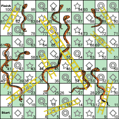
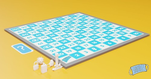
We started planning the interactive project with a long brainstorming session of many different ideas for each category that the client brief wanted us to follow. We had many different ideas; however, our favourites were following the category of its main use being for school groups. We originally had the idea for a remake of monopoly with places in Winchester swapping out with the normal monopoly locations, however, due to researching online and finding that it was already created, we realised that we could not go forward with this idea. After further brainstorming, we came up with an idea sticking to the board game area, where we would change up an old board game and bring a new light to it. This old board game was snakes and ladders. When we chose this game, we had to think of ways of changing it into something unique, whilst following what makes a successful game in modern times, and so we came to creating a custom deck of cards that would be activated on some spots of the board to trigger an event. Yet at this point we still felt the board game was lacking something, and so we decided to involve Covid and its many implications in the game’s narrative, hence the name ‘Shambles’, a light-hearted way of describing the whole Coronavirus situation.
Design Process
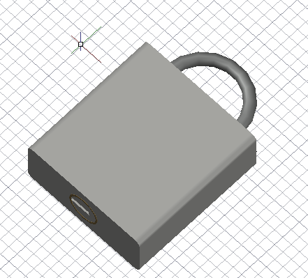
Oskar was the main design student in our group, and he got straight into designing the logo and board for the game, Chris was the CAD student, and he delved into how the player pieces would look ready for the 3D students (myself and Ervins) to model into reality. The designs and early CAD box models were created and adapted over the first few weeks of the project, assuring they were in the best state they could be ready to be taken over to blender for the actual modelling to begin. Moreover, I got myself got involved with the design process helping the CAD student on different ideas for the 3D models of the player pieces, with different designs for each piece so that the 3D students could have choice of what to Model depending on their skillset.
Stages of Asset Creation
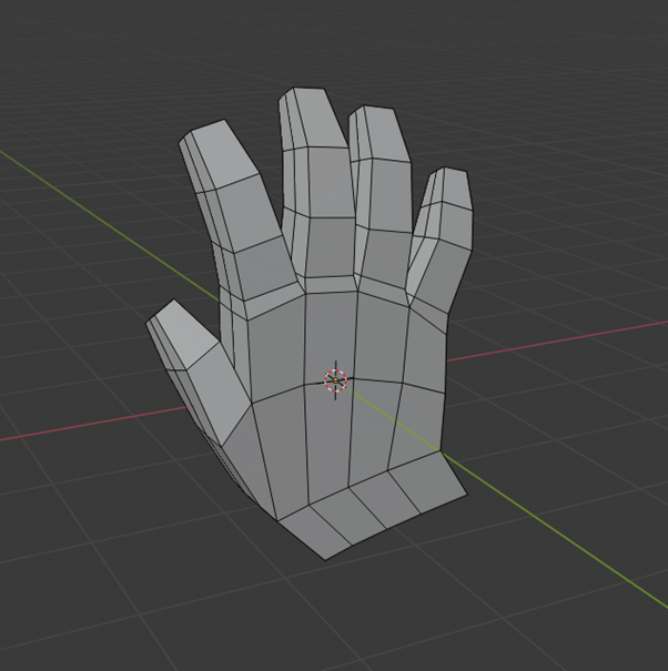
To make my way from looking at the designs of what I would be modelling on Blender, to creating and rendering their final models, I had to go through several stages of development. Firstly, I began by adding the basic meshes into the blender scene that I would be modifying into the right shapes for the player pieces, which consisted of a Cube and cylinder for the lockdown lock piece, a cylinder for the handwash bottle, a UV sphere for the covid cell, and finally multiple cylinders for the PPE glove. After this, I got to work on altering the shape of each mesh, making sure to give each player piece realistic shapes holding true to their real life counterparts, and so this involved a very large amount of curving edges by using the bevel tool, and also making sure that each part of the handwash bottle ,for example, fit to scale compared with the rest of the bottle to ensure that the shape was not short in some parts and long in others, but the right size across the board. Once the right shaping was created for the models, I now had to create the soft plastic material that is typically used in board games for pieces, and so to do this I needed to assign the correct qualities to the material, which included having to increase the roughness to quite a high level and adding specular tint slightly to help it reflect light a small amount, like real plastic does. The colour of the pieces was unique to the main colour associated with each item, and so I ended up using black for the lock, blue for the handwash, green for the covid cell and finally a greyish white for the PPE glove.
Rendering
To advertise the product clearly, both myself and Ervins created a 3D Still Render of the board game with its pieces ready to play to showcase what it would look like if we were able to 3D print the pieces and make the board game in person, which we could not do due to Covid restrictions. Although our scheduled time to work on this was very short, we managed to mostly finish it, however we did not get to adding the finalised materials to the player pieces as we had not finished them at that point. For the still render, we further added in the mystery card that would trigger as an event on certain spaces on the board, so the main features of the game were all laid out ready. We placed the board and its pieces in a yellow background as we were planning on using that as the primary packaging colour if we had enough time to get to creating it. The lighting for the render was simplistic yet effective, it was a white light that we used at its default angle and we tweaked the number of light bounces and intensity of it in order to give the product realistic shadows.