The WALL-E Project
- BLENDER - QUIXEL BRIDGE -
Project Brief and Research
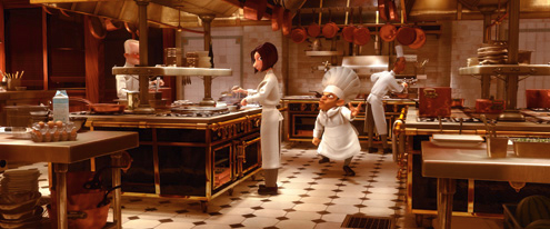
For the final semester of my university course, I chose to work on a personal project that I had been thinking of doing since starting the second year. My favourite childhood films were, like most people’s, Pixar films, especially the likes of Ratatouille, Up and WALL-E. Originally I had planned to work on a still render of the kitchen from Ratatouille, however after much research into previous work on the same scene, there were already far too many to compete with, and I wanted to work on something fresh and unique. At this point, I explored the world of WALL-E more, selecting different iconic locations that would provide plenty of room for development and creativity to flow. For this project, personal aims were set in order to keep productivity at a maximum and encourage solid progress throughout the semester. This project was set to take place for over 12 weeks after the initial research stage.
I chose to again use blender as my main 3D modelling software as it is the one i am trying to become most skillful with, and alongside this, continued to use Quixel Bridge to utilise Megascan textures and make the work look more professional in it’s end product. Furthermore this provided a strong sense of realism for certain textures, improving the grittiness of the apocalyptic world. When exploring how technically feasible the project is, I swiftly came to the conclusion that the tasks ahead were completely within reach and would provide enough development to discuss here in detail and showcase my skills. The choice of only 2 software for this final project was to enjoy working on my passion project with the tools I am comfortable with, solidifying my current knowledge and expanding it with new features and methods too.
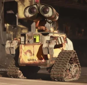
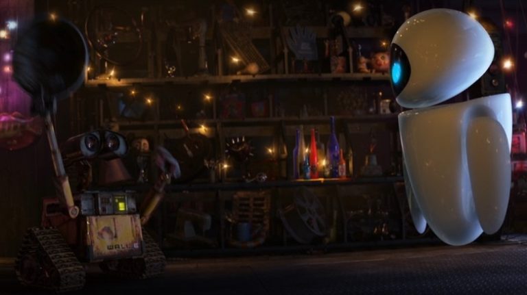
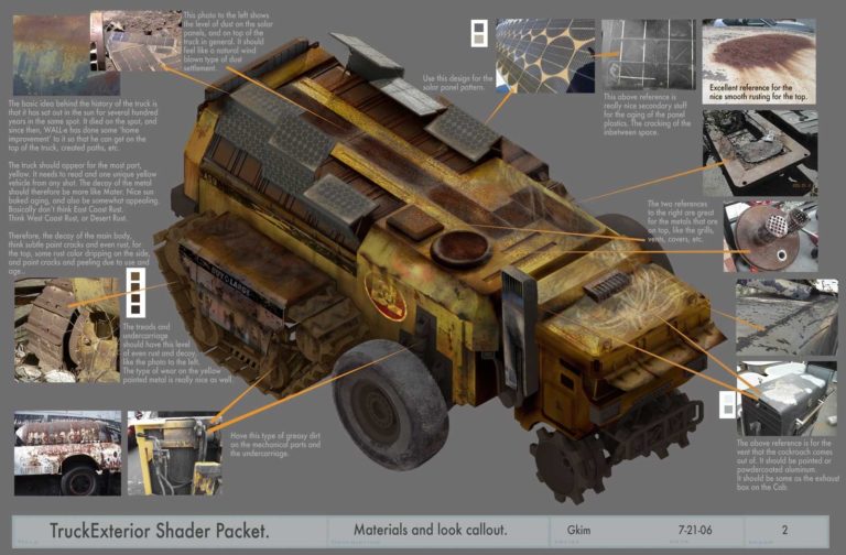
My research involved watching the film ‘WALL-E’ through several times and finding key screenshots to focus my work on and highlight inventory for mass model creation. This was extremely useful as my memory actually failed me at moments and I remembered specific features and scenes differently. In addition to this, I researched scenes in other Pixar films like the previously mentioned Up to have back-up options in-case any problems occured with the WALL-E scene creation.

Planning
One of the first stages of the planning for this project was time management. I created a GANTT chart detailing each step of the project over its 12 week span, with every 2-3 weeks typically being a new chapter to work on. I We chose to split the workload into specific and separate stages as it clearly identifies the workload and it’s many different steps for the reader to understand . Furthermore, it set solid deadlines for myself to keep to in order to get the work done on time, improving my time management skills in the process.
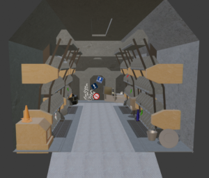
After this, the scene of focus for the still renders needed to be chosen, with there being several solid options to choose from. Each location had a large amount of character and charm that provided plenty of room for creative juices to flow, however, the WALL-E home scene simply could not be beat as it was so small yet felt as if it had more to offer than anywhere else in the source material.
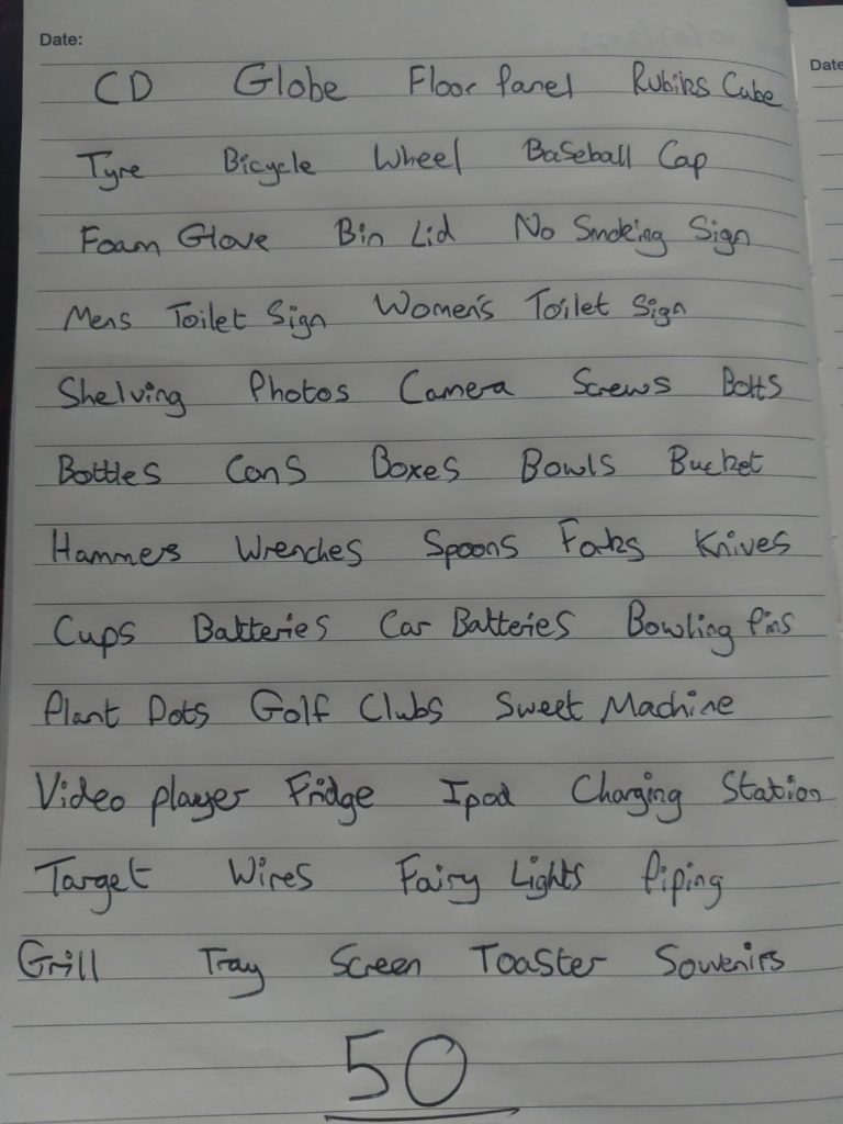
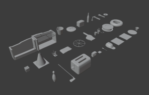
The next stage of planning was the Model Inventory creation. This involved listing the mass of objects and unique features that could be found around the WALL-E home scene, and with a massive amount of objects spotted across the scene, some completely unidentifiable, my work has already ran into a challenge.
An idea that didn’t make it through to further development was creating an animation of WALL-E exploring his home and interacting with items as he does in the film, however, due to the high workload of this project already, this was set as a very far potential outcome if there was leftover time to work on it.
Modelling and Texturing in Blender
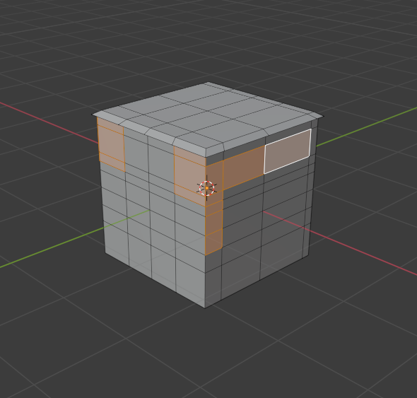
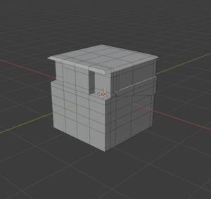
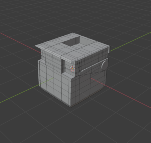
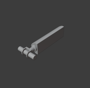
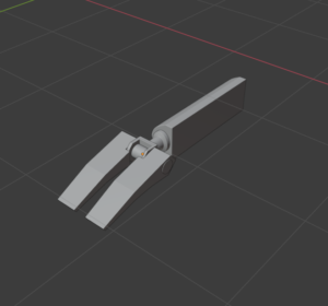
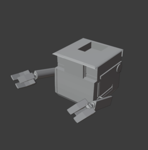
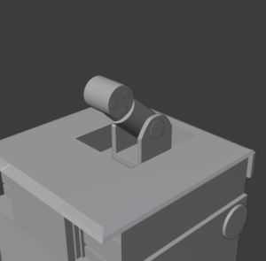
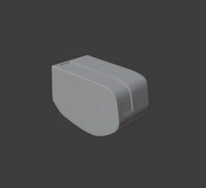
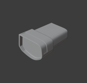
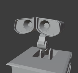
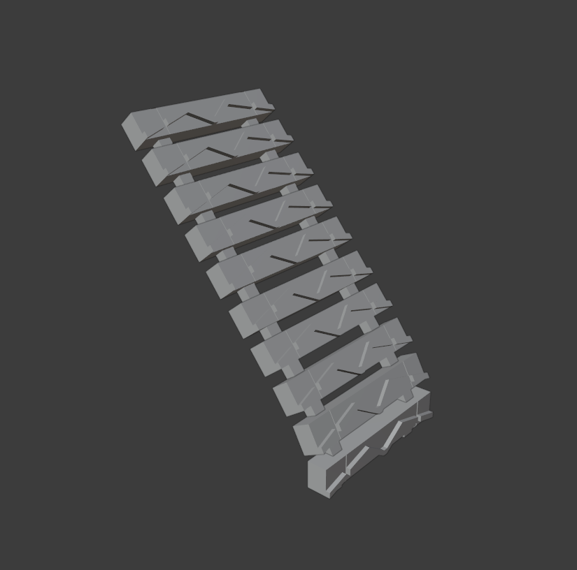
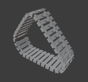
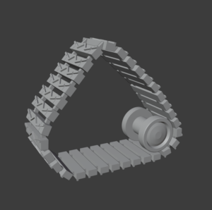
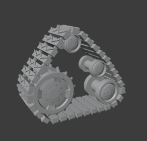
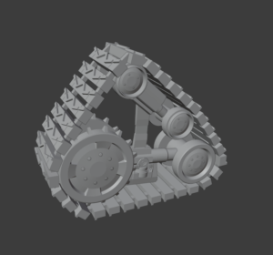
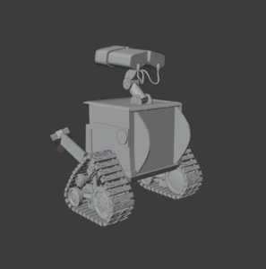
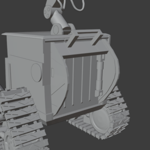
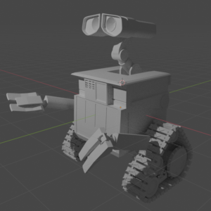
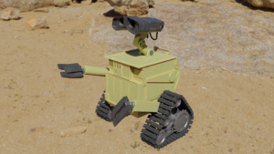
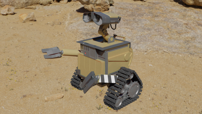
Making the WALL-E Model involved several steps; Block Modelling the initial body shape, sculpting the blocks into the correct shapes, detailing added across the model, UV unwrapping and finally texturing. I started the block model by placing a reference image in the background of the scene and quickly adding cube meshes and resizing them into place of the separate parts of WALL-E. As seen in the image carousel to the right, from here each piece was fleshed out and detailed accordingly, slowly creating the recognisable character we know and love. Next, the modifiers needed to be added (Mainly Boolean and Subdivision Surface) in order to finely tune each piece into the more identifiable smooth surfaces, and making the mechanical pieces interact logically, with bolts and pieces interacting as if they are holding each other together.
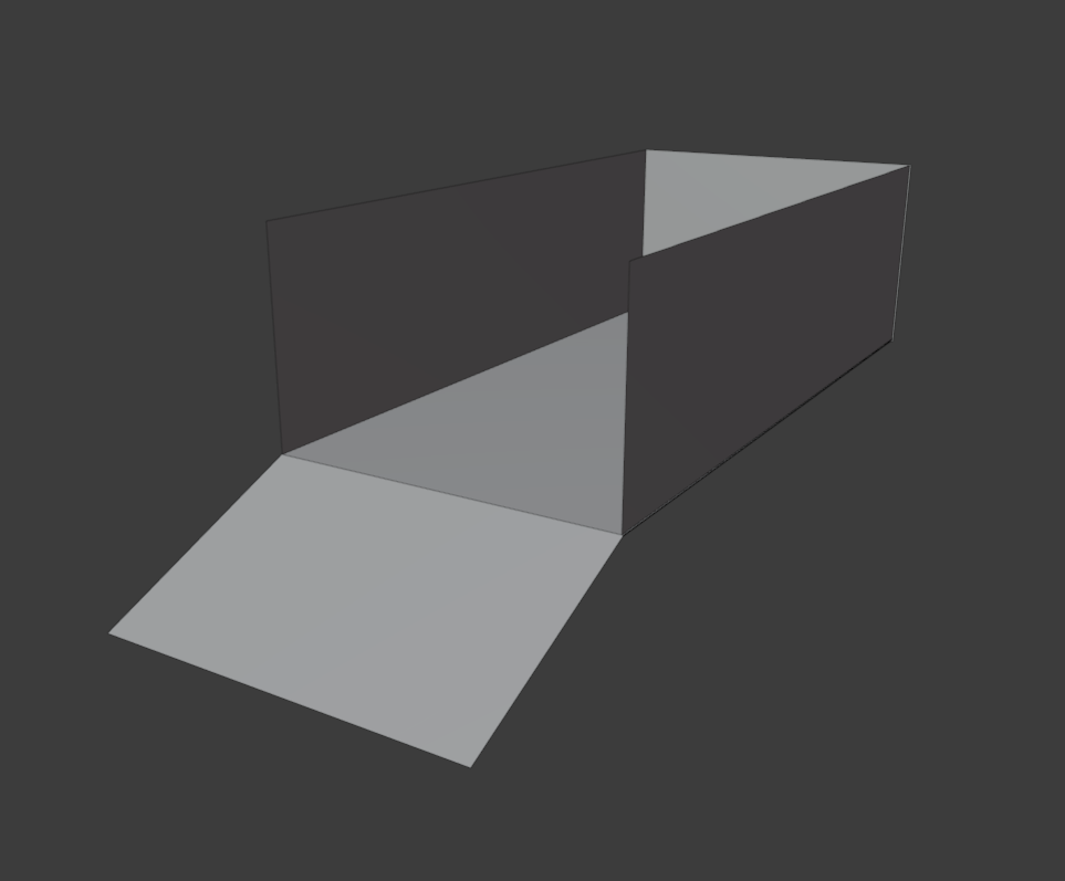
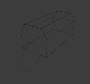
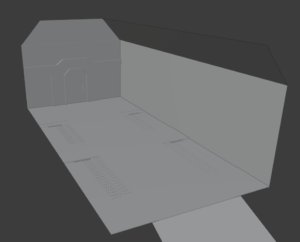
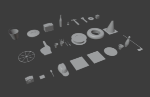
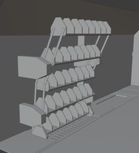
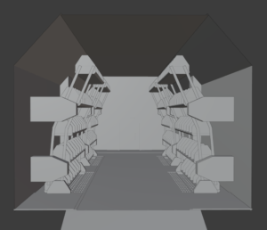
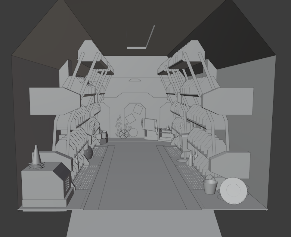
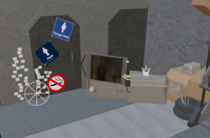
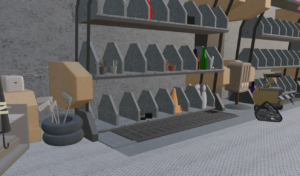
Making the Scene and Asset Models involved mapping out the shape of the Home Scene and scaling the walls, floor and ceiling into the accurate shape to match the source material. Detailing was then sculpted into the pieces of the room, marking pathing and creating doorways for the home to mirror the animations dimensions. The mass asset creation was the longest part of this project to complete, with a large amount of separate models needing to be modelled and textured, with a finite amount of time allocated to this task. This task could not be fully completed and the full list of inventory was not created for the scene, only the most unique or important models were prioritized.
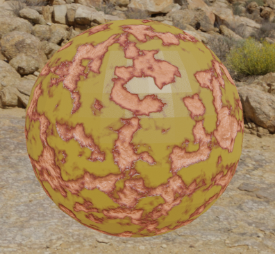
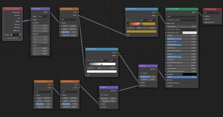
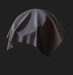
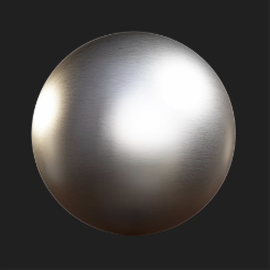
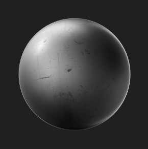
The texturing stage involved importing several types of metal and even fabrics from Bridge and adjusting the scale of each in their corresponding UV editors to create realistic sizing and make surfaces reflect the source material appropriately. After selecting the correct materials, these were baked onto the models with a 4k resolution each and the render engine switched to cycles to work on light reflection on the materials. In addition to this, several textures were created from scratch, one of particular interest was the bottle textures, where coloured glass were created with the scene lighting able to interact and pass through as it’s real life counterpart would. A texture attempt the would have been beneficial to finish was rust for the WALL-E model, however, even after playing around with settings and colouring for a while, it never seemed to fit the model correctly.
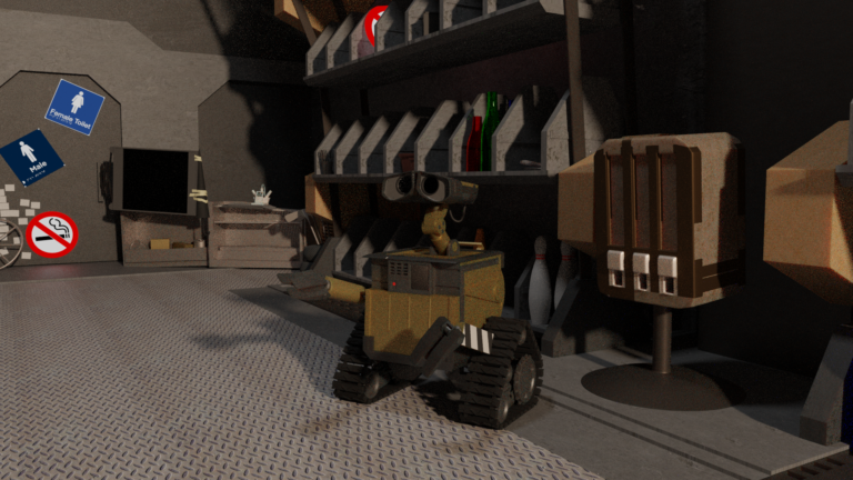
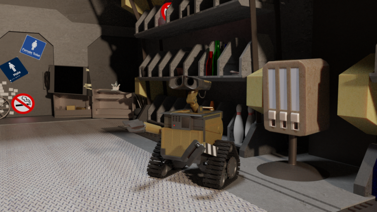
When presenting the models to peers, mainly positive feedback was received, with several comments made on room for improvement with the project work so far. One comment suggested that the detailing on the WALL-E model was not showcased enough due to default lighting not fully enveloping the shaping and forming shadows where there would be in the original animation. Working solo on this project allowed me to work at my own pace and cut out and conflicts of interest on the project development, which often occur in group projects and affect the focus of the workload. One limitation of working alone however, is that due to the massive amount of model creation and scene cluttering (when a scene needs to be filled with models to look like a realistic and interacted with environment) the progress was slower than initially anticipated and affected the final stage of the project before deadline.

Lighting and Rendering
After model creation had finished, poly count was minimised on each model to reduce file size and rendering times.
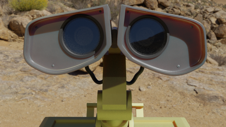
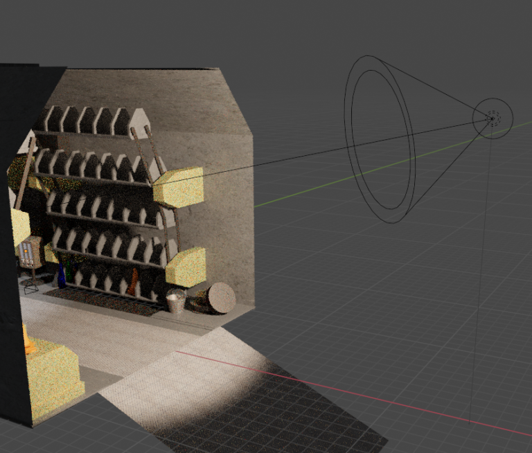
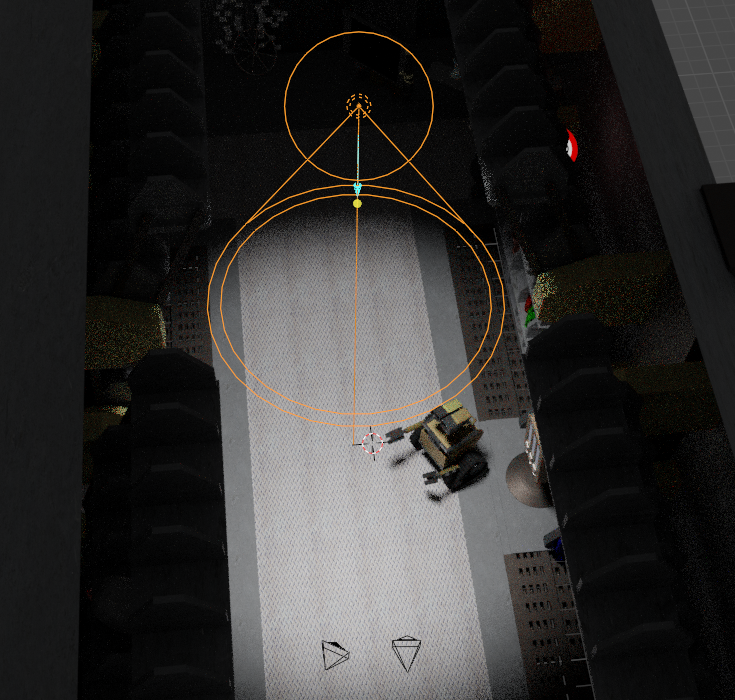
To achieve the ideal reflection for materials such as WALL-E’s glass in his eyes, lighting needed to be strong enough and angled correctly to bounce the light onto the dark glass texture and replicate the realistic texture qualities. The light also needed to reflect off of metal surfaces correctly too, and so a spot light was added into the scene alongside an area light. The spot light acted as the sun outside the home beaming in, tinted a warm yellow to mirror the hot sun in the apocalyptic world. The area light acted as the ceiling light in the vehicle home, providing a weaker and artificial feeling light to dimly light the scene from a different angle also, this changed however, when realising that the spot light gave the right effect of a dimmer light interacting with the scene.
Initial plans also included adding working fairy lights across the scene as a final touch as this was a major piece of character for the room within the animation, however, due to time constraints and further acknowledging growing rendering time, this was not included.
The render was in cycles and had a Render setting of 256 and a Viewport setting of 64. This is quite a high quality render because I wanted to approach the project with a similar quality to the original source material, moreover, the max bounces were increased within the project to improve the lighting of the scene, with the cost of a slightly longer render time. Due to time constraints, I was not able to fully explore the complete lighting planned for the scene, with plans to add a custom HDRI to improve colouring of the scene through lighting.
File Organisation & Handover Document
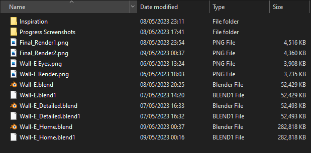
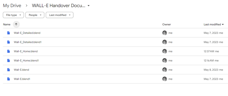
Although this was a personal project, I created a handover document to simulate how this work should be correctly labelled and ready for download for any future work by, for example, a fellow employee at an animation studio.
If i were to continue work on this project, I would do several things to improve the realism and world-building of the scene. One thing I would do is overhaul the textures in the scene with edited custom textures adding logos and writing reflecting the branding in the WALL-E world. Furthermore, I would also dedicate more time to clutter building. Recently I had found out that alot of animation/game studios (for example, Bethesda) hire teams specifically focused on cluttering scenes with random assets to improve world-building, which usually involved multiple members due to the large amount of time involved with the task.
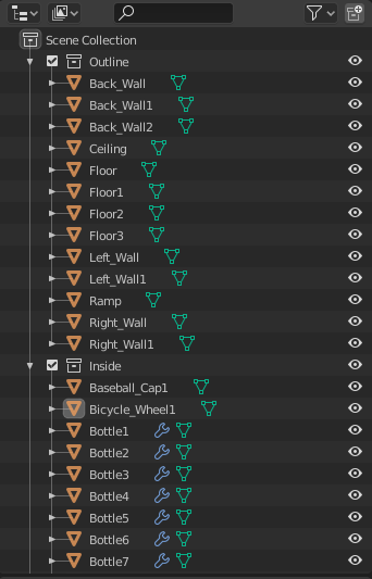
A fairly simple structure was kept throughout, and files were named, for example, Bicycle_Wheel1 or Wall-E_Detailed.blend. This naming convention is very clear to read and understand and so minimising any issues concerning confusion for future development.
Download Handover Documents Here!
