The Train Station Project
- BLENDER - ILLUSTRATOR -
Planning
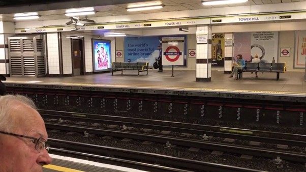
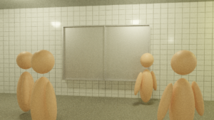
Before even knowing what I was modelling for this project, I was first choosing what RSA brief to work on, and when looking through all of the different options, the one that stood out to me the most was the Transformation Station brief. This brief involved creating something new within existing train stations to give them another purpose beside travel and involve the community. On the 3D side however, without knowing what I wanted to create, I knew that I would be modelling some form of train station, and so I got started planning what station I wanted to re-create and how. This involved me researching online different stations around London and trying to find some that had a fair amount of images to work off of, and one that stood out to me was Tower Hill station. I had found a video on YouTube showing a platform off and I knew that this is what I would want to make. I took several screenshots of different angles of the station and began mind-mapping all the different features I would need to create.
Design Process
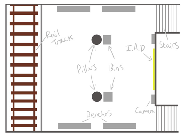
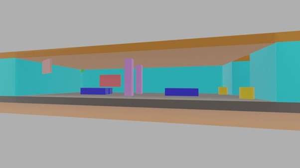
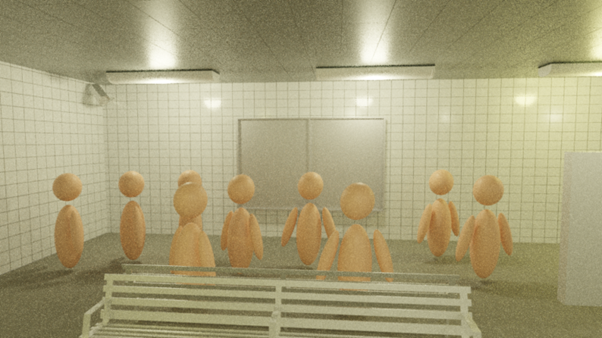
One of the first steps I took in designing the layout for the station was creating a basic design of one that I made up from scratch but including all the assets I would need in the real thing, and then all that needed to be done was moving it around when making it in 3D. I showed this basic design to my class for feedback and they helped me see that although very simplistic, it had everything that a real station would have and we agreed that it would evolve into my final piece well. The next step I took was creating a storyboard for what i originally intended to be an animation, however when speaking with my lecturer, we came to the conclusion that it would not showcase my work in its best format and so i decided to make the storyboard panels still renders showing the I.A.D (Interactive Art Display), which was what my idea for fulfilling the RSA brief was, and how it would be interacted with my users in the station. These storyboard panels were quick sketches to roughly outline what I wanted to create in Blender, where I would add much more detail to them. The final step of the design process was spending a short amount of time in Blender crafting a Block Model showcasing where everything would be in the scene.
Stages of Station Creation
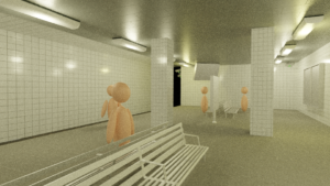
To push my designs of the station into the real 3D thing, I started in Blender with creating a plane in the scene, with the same measurements as the real station in London I had chosen, and building my work up from there. I quite often used the extrude tool to add in detailing and different levels of the platform, including the staircase which was simply the loop cut and the extrude tool exclusively. Once I had created the shell of the station, with each part of it; the walls, the ceiling, the floor and pillars and so on, labelled and colour coded, I set to creating the assets I would be using within it. One asset I created was the CCTV camera, which definitely involved the most detail and time dedicated to it. I created it with each part separately so that I could actually piece it together part by part including screws and brackets to make it look and feel heavily realistic. I used several images in a mood-board I made for reference and the final product really looked the part, and I was extremely happy with it in my scene.
After making the separate assets, the next step was importing them from their different files into the main station file, ready for use. This was a quick step to complete due to the simple UI of Blender, giving me the options to import in other files with ease, taking no time at all. Once everything was in the scene and placed where they needed to be, the penultimate step was to create the textures for each part of the environment and assets. To do this, I used Quixel Mixer and Bridge, Mixer being used to make the textures themselves and Bridge to import them through to Blender. I practised using Mixer for a month during my time in Semester 1, and so when it came to making these final textures I had a blast, completing them with the detail I felt they needed in what seemed like a very short period of time, which left more time figuring out how to export them through Bridge into my Blender file. After some trial and error I found the correct way to do so and managed to get my nice clean textures into the scene ready to be added. The final stage was of course to finally texture each part of the scene, and so using the imported textures, I mapped them up, tweaking some of their nodes a little once attached to assets and the environment, and when completed the scene was starting to take real shape.
Lighting and Rendering
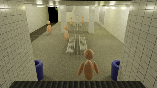
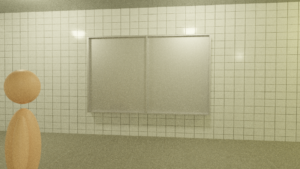
Keeping in mind that my scene was set in an underground train station in London, I knew that the lighting I would have to add had to felt very artificial to mirror that, as actual sunlight would not be reaching down there. To create this atmosphere, I added several point lights (8 to be exact) attaching each to their respective light models created in the scene, giving them a dull yellow hue and 7500w of power where i found them to give off the appropriate amount of light into the scene. Unfortunately, due to problems with my home computer i had to switch to using Blender on my laptop with not the best amount of V-RAM, which made rendering the full scene near impossible as the program always crashed. Therefore my renders had to be simplified and have the resolution lowered and I also had to lower the quality of some of the textures on the assets and environment, which when finally being able to render the scene, didn’t feel like did it justice at all. In the future, I plan on coming back to this project and spending time getting it back to where I wanted it to be using a more powerful device so I can be proud of the work I put in. Moreover, with this I would like to be able to develop the screen for the I.A.D to show off its features and how it functions with user interaction.

The Jane Austin
Project
- BLENDER - QUIXEL MIXER & BRIDGE -
Planning
For this project, we had a huge amount of different briefs to choose from, and each of us in the class were to choose which one we thought we could perform the best in, and so I had chose the Jane Austin project. This involved re-creating different buildings and streets in the Winchester City in their early 1600’s forms, a.k.a when they were newly built, and I believed that I could manage to model at least a couple of buildings, if not then a whole street. When gathering with my group, we looked at the different buildings and streets to work on and decided on who could do what, which is where i chose to work on Symonds Street Hospital and the other buildings down its road too. We were all given as much content that the client had in floorplans and old photos, and my buildings had nothing to work from, so I had to turn to researching online for it all.
Research
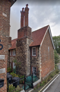
Due to having no resources to work with, I began to search online for any useful images of the buildings at any time over their existence and there was barely any, however when researching into typical Georgian architecture, I had discovered some very interesting information regarding the reasoning for some of the certain design decisions of buildings. For example, one of the buildings i worked on had blocked up windows, and although we initially theorised it was just for symmetry, we discovered that it was also however like it because of a window tax introduced in the very early 1600’s, and so the less windows to a building the less tax had to be paid on them. With no luck on images of the buildings or floorplans of any kind, I had to use google maps to look at the buildings in their modern forms and I struggled with whether some parts of the building were extensions made recently or not, as I would not be modelling those parts.
Stages of Building Creations
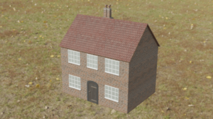
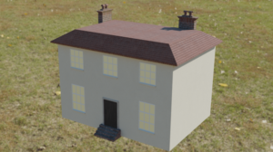
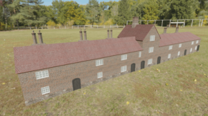
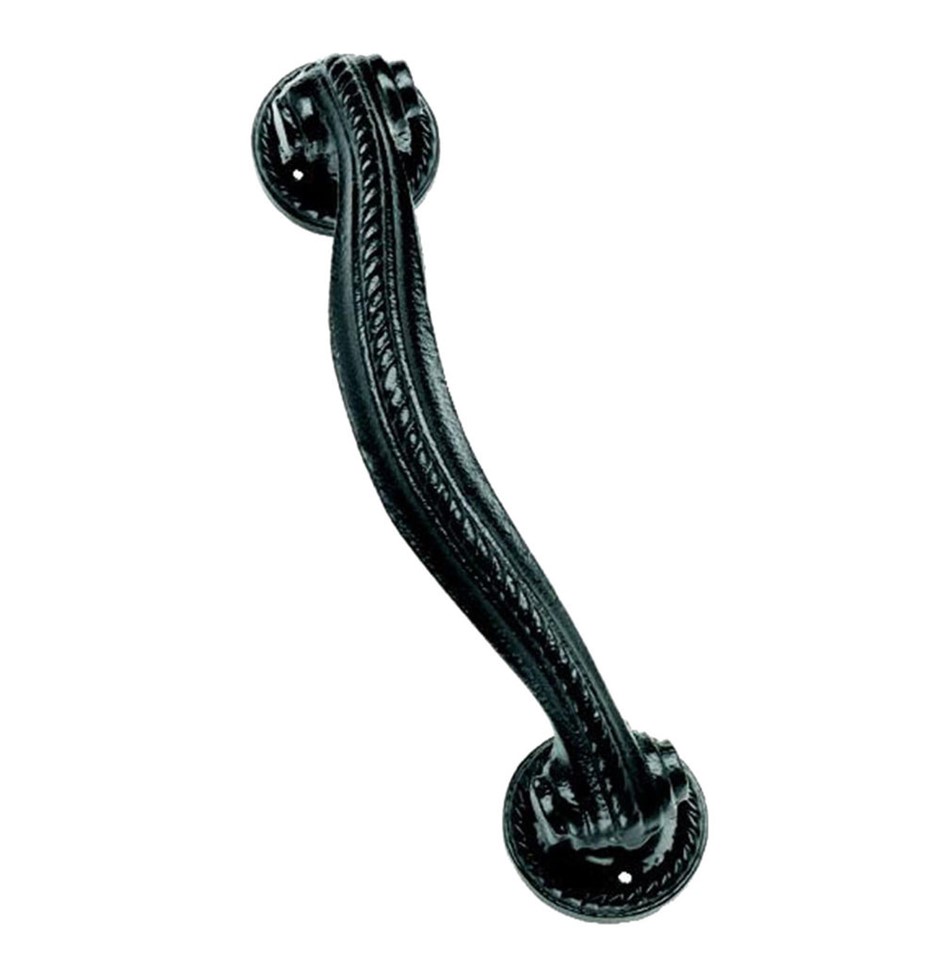
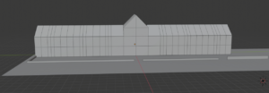
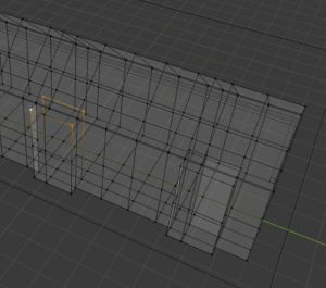
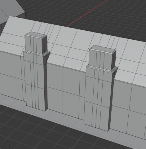
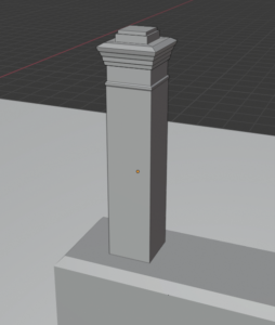
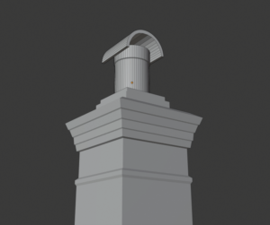
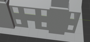
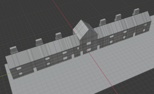
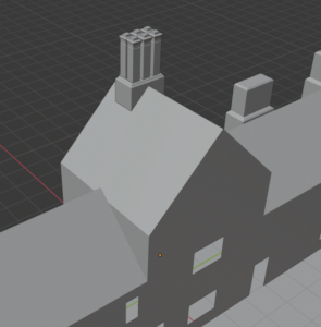
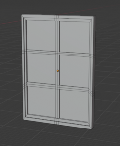
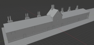
Starting with the main building I would be making, the hospital, I began using rough measurements I found when using google maps and a car for size reference, I created the base of the hospital all the way round and then scaled it to the right height before adding the roof on top separately. Next, I created plentiful loop cuts around the model so I could mark out roughly even place markers for windows and doors to be placed when getting around to that part of the modelling. Once the building was fully built up minus the details, I then got to work on making a window that I could resize when necessary for easy duplication across the project to save time through it. After this, I focused on placing these windows across the building where needed, referring to google maps the whole time through, and then i got to work on creating the doors dotted around the building, using research on Georgian door handles and things in order to best match what they would have looked like. Once modelled, I placed these in their correct locations too and I had the building coming together very smoothly, with only detailing needed around it to finish, and then I would perform the same process with the other buildings I was creating.
Texturing and Rendering
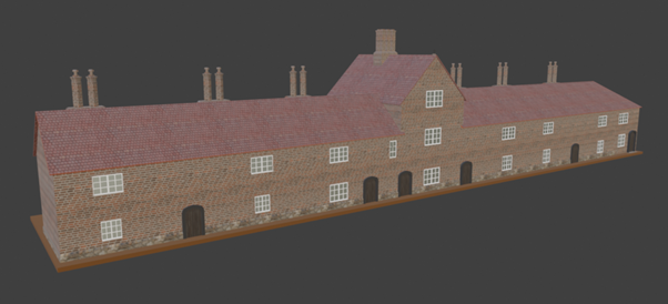
One of the final and most important stages to finishing my work for it to be exported into the clients bigger file, was to create and add the textures matching what the Georgian materials would have been, and luckily the buildings I worked on were mostly in their original state so I could fairly easily see the textures I would need to be making. And so I got to work on it, making sure to remember to add no imperfections or anything as these buildings would just have been built so they would be pristine. I went through the same process as in the previous project using Mixer to create the textures and Bridge to export them into Blender and began adding them to each surface of the buildings, again tweaking the nodes here and there to better fit the buildings looks. I then decided to create some renders of the buildings fully complete to showcase the final product and I am quite happy with the result.
